Vic’s Mix
When a new company who’s sole purpose was to create delicious mixes of fruits and nuts, I knew I couldn’t say no! Vic’s approached me for help with their new product line. The needed a complete branding solution from a new logo, to packaging, labels, business cards, flyers and more. To go along with the branded marketing materials, we would also develop an eCommerce website dedicated to sales and customer support.
The company offered several different varieties, each with their own unique label and packaging. Vic’s was sold in stores nationwide and gained a following amongst hikers and bike-riders as a quick pick-me-up on the go. Here’s how we did it!
Creating the logo
Vic’s wanted importance placed on the organic and healthy nature of their mixes. We decided to start with a bold, warm logo that felt as if it could embrace the customer. It was designed to induce a feeling of comfort and simplicity to draw new customers in.
The client liked these versions, however they felt the font weight was a little too heavy. As a bit of a test, I actually decided to reduce the weight quite a bit, and see what it would look like in a much lighter font.


After seeing the results, Vic’s felt the heavier weight of the text aligned more with their original vision, so they decided to stick with the first iteration. Next, it was time to choose a color palette. We experimented with all the different hues from their mixes to bring as much organic color into the palette as possible.
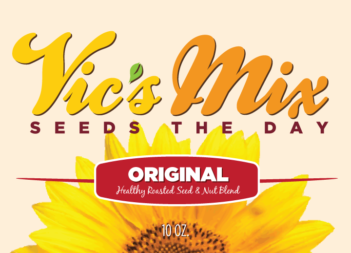
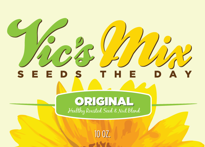
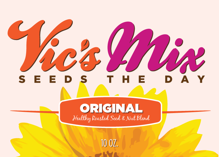
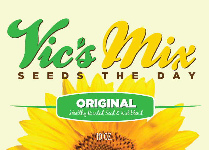
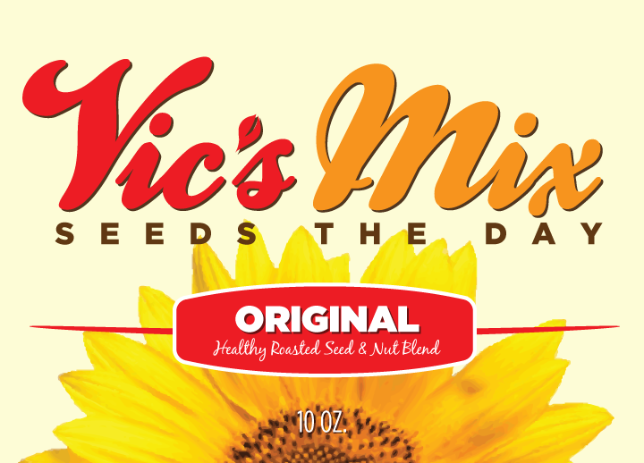
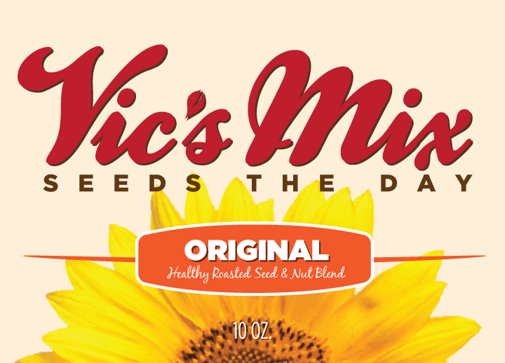
Almost finished! Vic’s did several internal A/B tests with different variations of the above logos and labels. They also showed their customers the logo with the thinner weight and most of their customers resonated with those versions instead. To compromise, we took one of the heavier logos from the light batch and made it a little thicker for readability. This was the final result:
