
In 2008 a mortgage company came to me with a plan. People building a house have to find a lot, then a builder, then a developer, then financing, and every one of those searches happens on a different site run by someone with an interest in the answer. They wanted one place where all four happened together.
The brief set a go-live date of the first of May and named the parts: find a lot, find a builder, find a developer, apply for a mortgage. The home page had to carry live mortgage rates. An online application had to alert a loan officer. Subcontractors and house plans were listed as future.
I designed and built it.
Four audiences, one site
The search was never the hard part. The hard part was that four different people had to feel at home on the same site: someone hunting for a plot of land, someone comparing builders, a developer marketing a subdivision, and someone applying for a mortgage. One generic interface serves none of them.
Each section got its own color and its own surface. Grass for lots, wood for builders, blueprint for plans. You knew which of the four sites you were in without reading a breadcrumb.
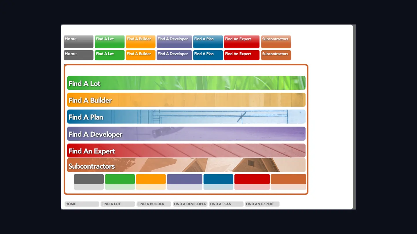
The home page had one job
The brief asked for mortgage rates on the home page. That’s the only number on the site that changes daily, and the only reason somebody comes back before they’re ready to buy anything. It earned the top slot.
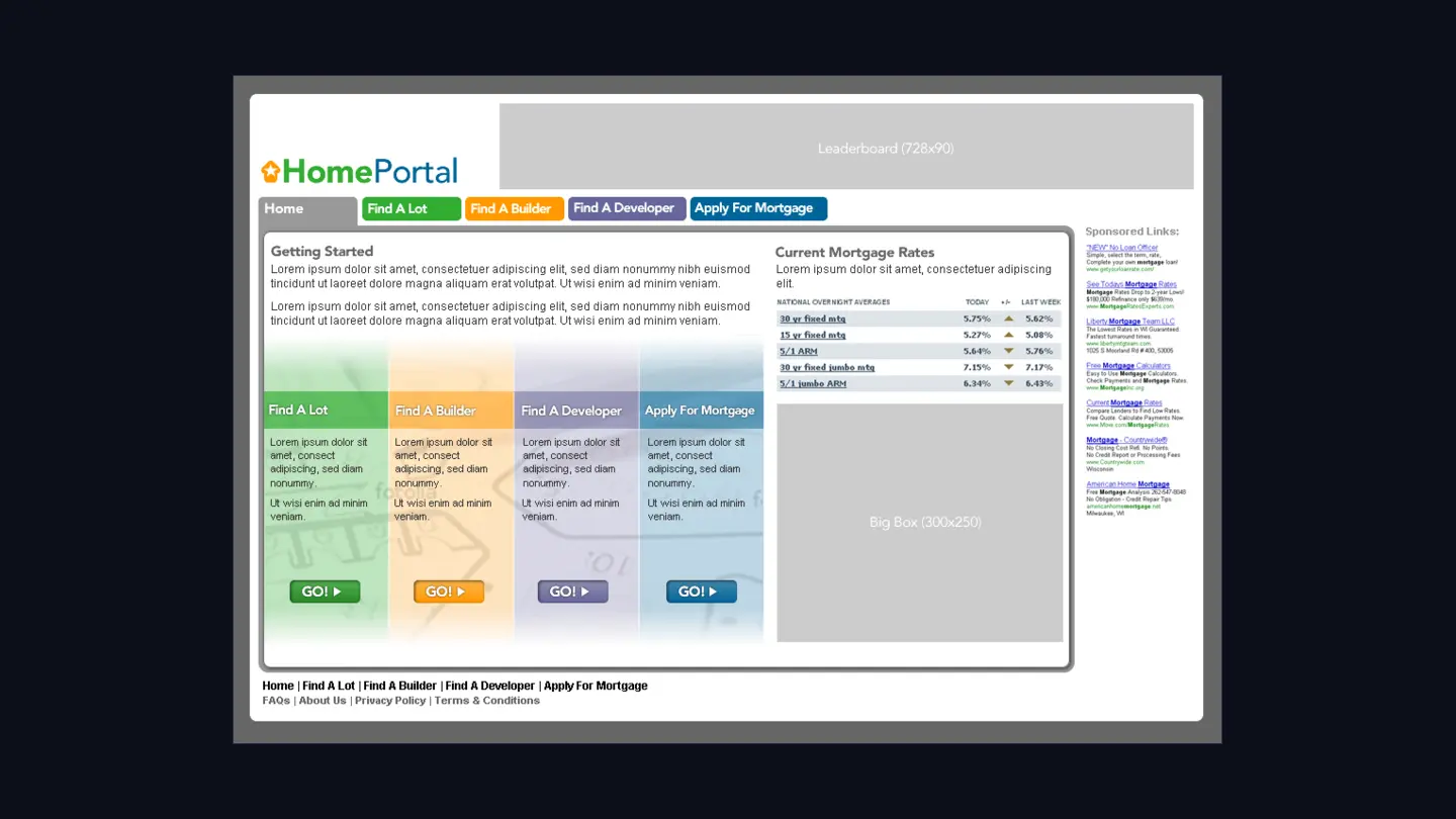
I drew the ad slots at their real sizes from the start: leaderboard, big box, sponsored links column. A layout that only works with the ads removed doesn’t work, and finding that out after launch is expensive.
Two passes at the same screen
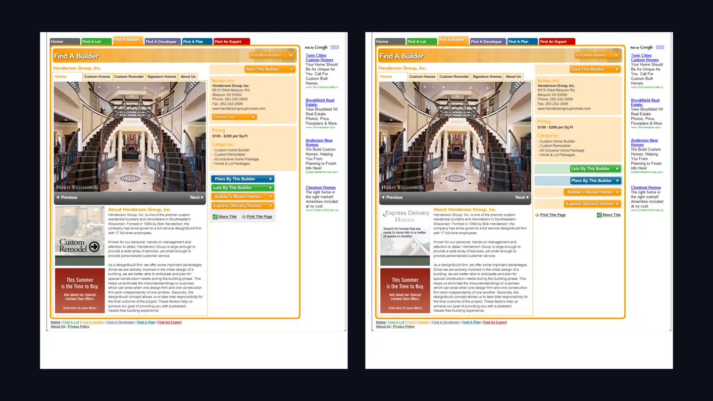
The builder detail page carries a lot: a photo gallery, the builder’s own sub-navigation, their pitch, pricing, categories, then cross-links into everything else they have listed. In the first pass the cross-links are a stack of heavy colored buttons fighting the gallery. In the second they get out of the way and let the photo lead.
That’s the whole revision. It’s what most design work actually looks like.
It shipped
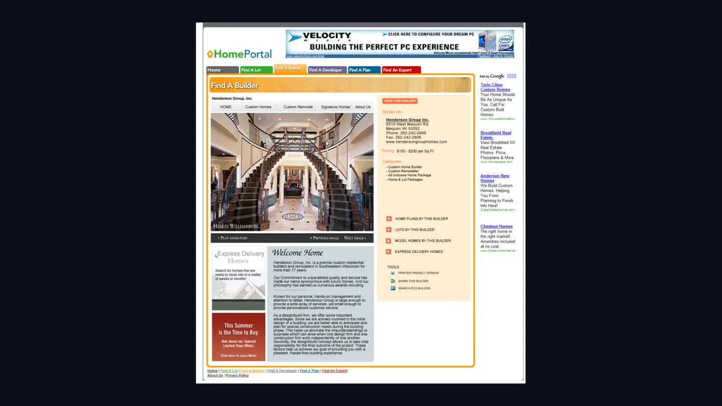
Behind it was an admin area with a section per tab: builders, lots, developers, communities, plans, experts, and a blog. Same component system I was using for content management everywhere else, in this site’s colors.
What happened to it
It didn’t last. The partnership behind it broke down, I moved to Florida, and the project stopped. Not because it didn’t work and not because nobody wanted it. It stopped the way most small ventures stop, which is that the people involved stopped being able to work together.
I’ve thought about that more than almost anything else I’ve built. The design was finished, the site was live, and none of it mattered. A product lasts about as long as the agreement between the people making it, and you can’t fix that in the interface.
The lesson isn’t about design. Shipping isn’t the finish line, and the part I controlled was never the part that decided whether it survived.