
Mayas: Made in Honduras
In 2017 a South Florida company asked me to build a brand around jewelry made by hand in Honduras. Stones and pendants, colors and decor from the Honduras area, sold online. No two pieces alike.
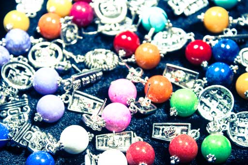
That is the appeal and the problem. Nothing in the catalog repeats, so the product under the logo is a different color in every photograph. The mark had to sit on all of it and still read as one company.
Creating the logo
I went bold. Eye-catching, recognizable in an instant. The shape came easily.
The color was harder. It had to be distinctive enough to belong to them alone, and quiet enough to sit beside whatever stone was in the photograph. Those two pull against each other.

Product photography
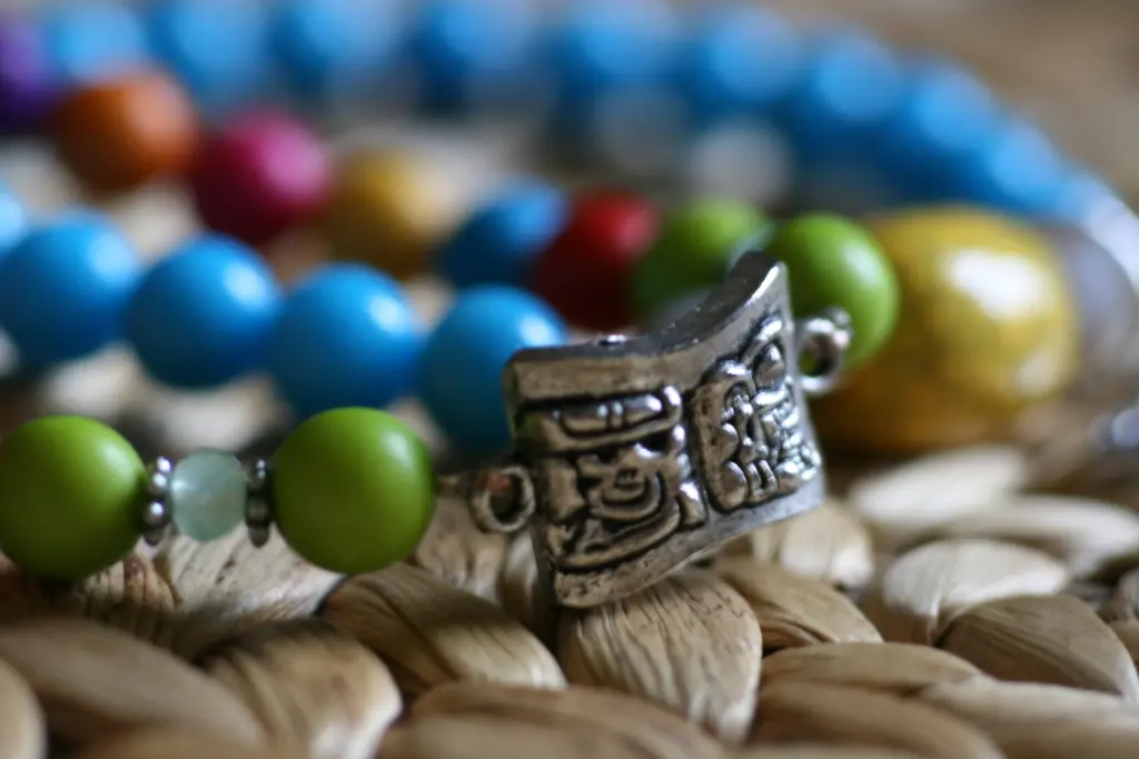
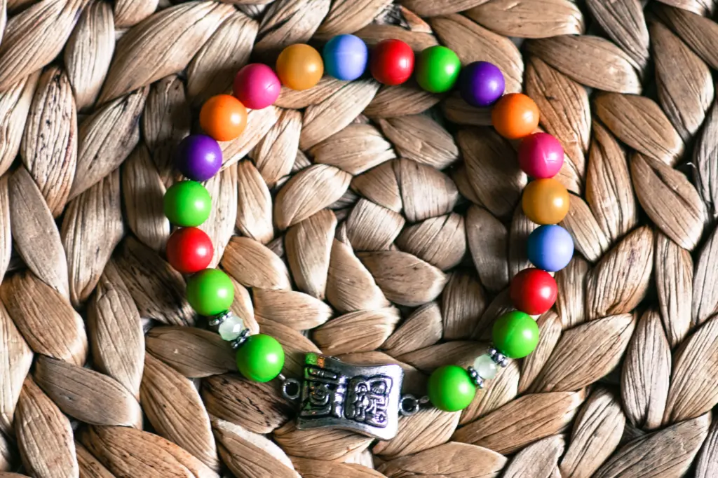
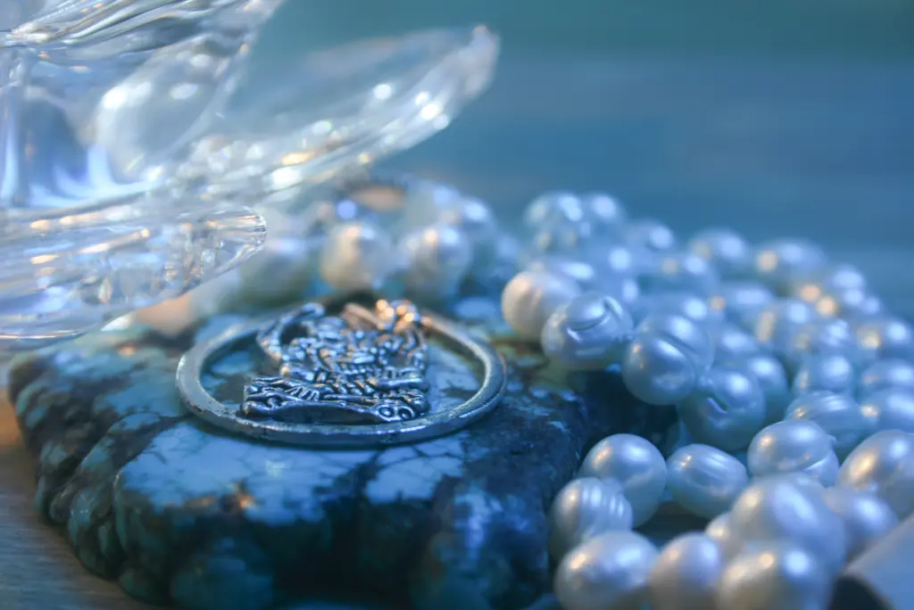
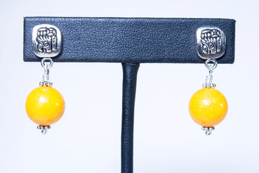
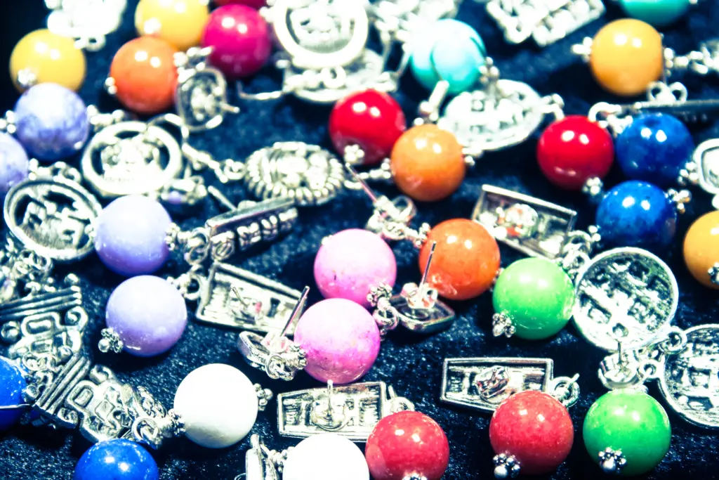
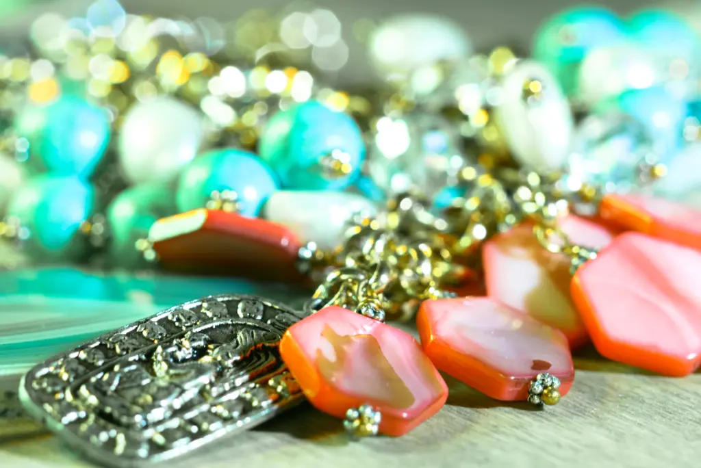
I shot the pieces myself. Plain backdrop, minimal colors, simple objects in frame. Every decision there was a subtraction. The jewelry was the only complicated thing in the picture, and anything else I added would compete with it.
Marketing and advertising
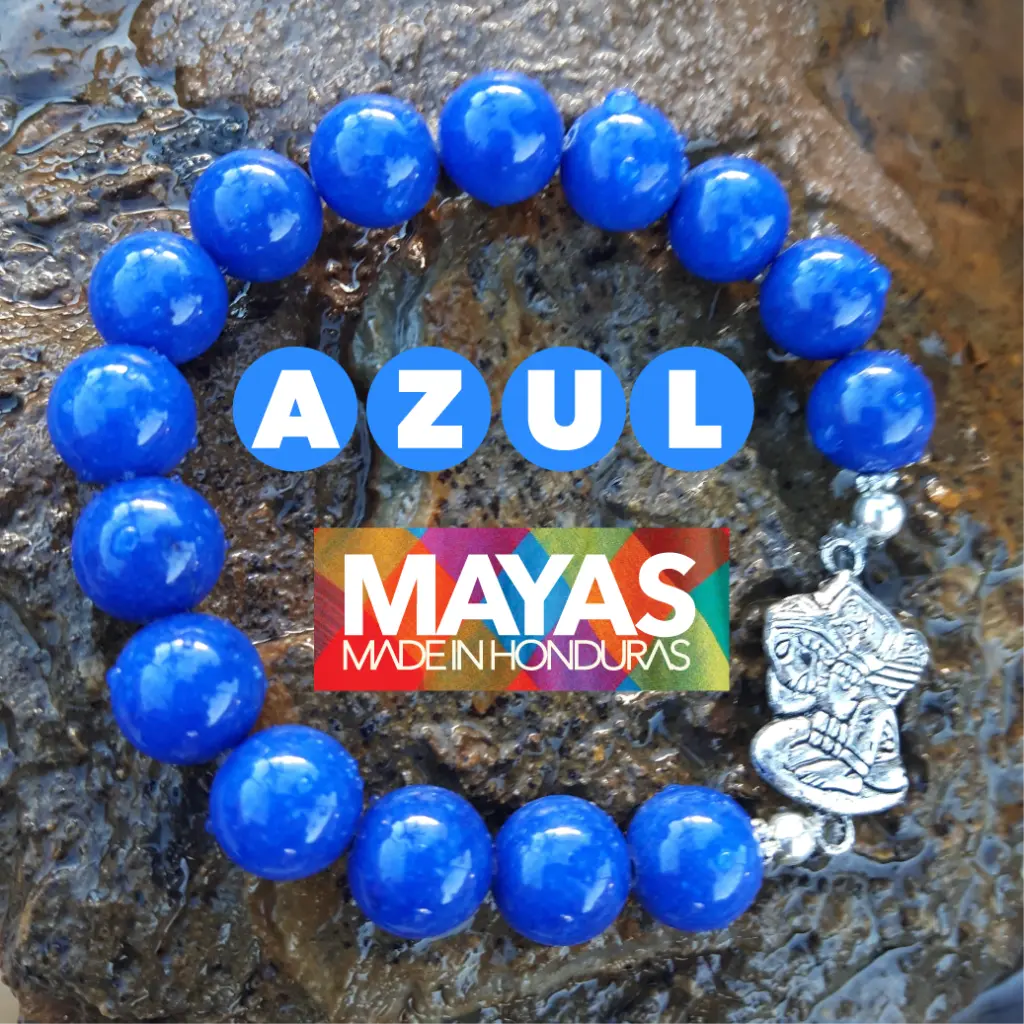
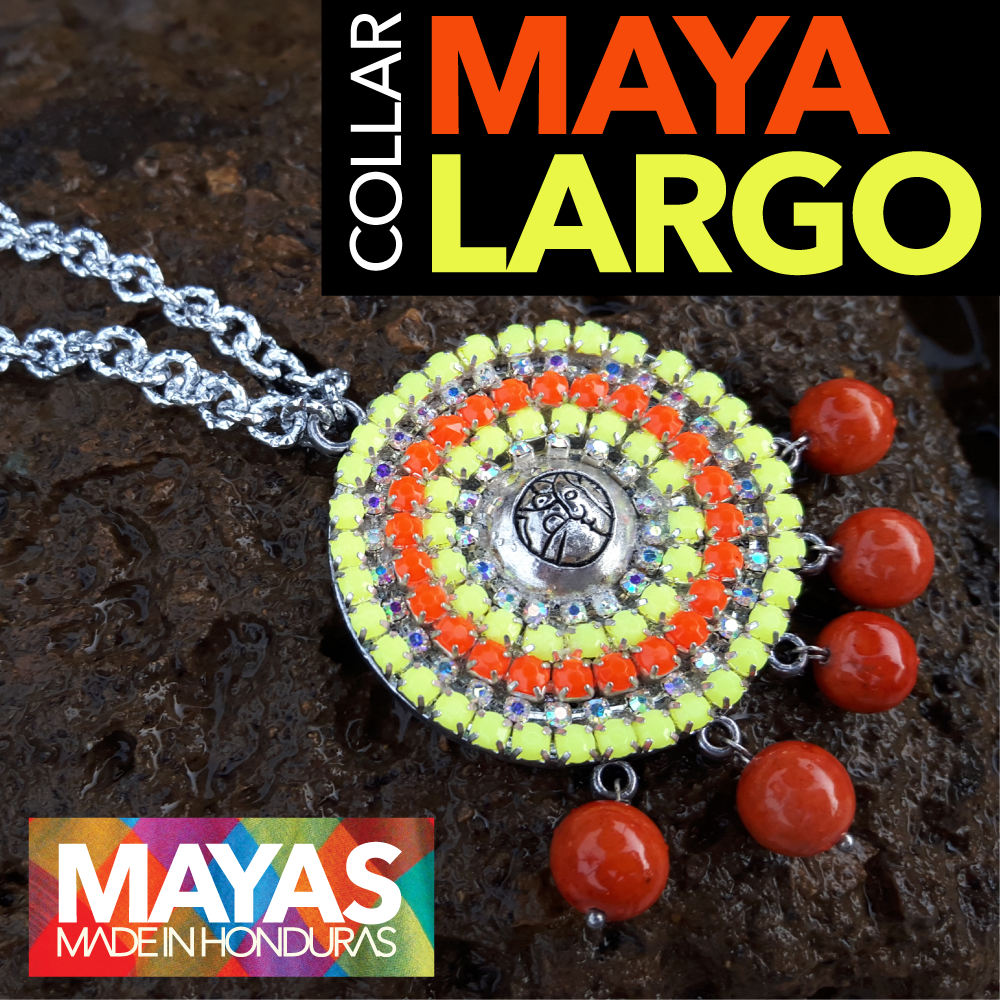
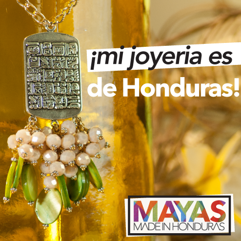
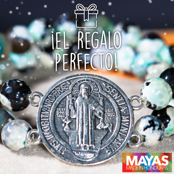
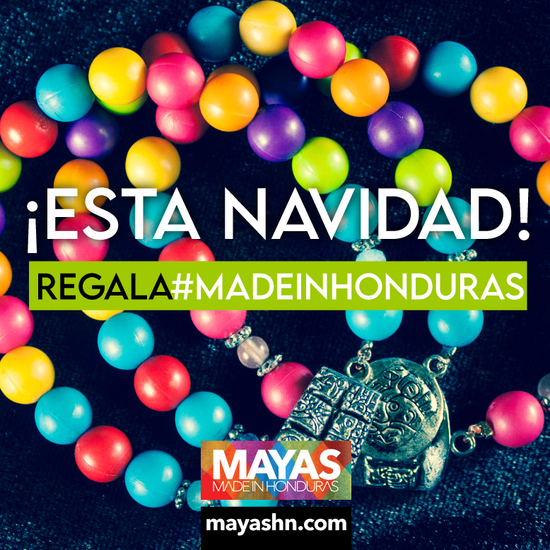
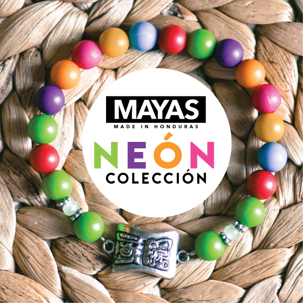
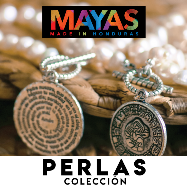
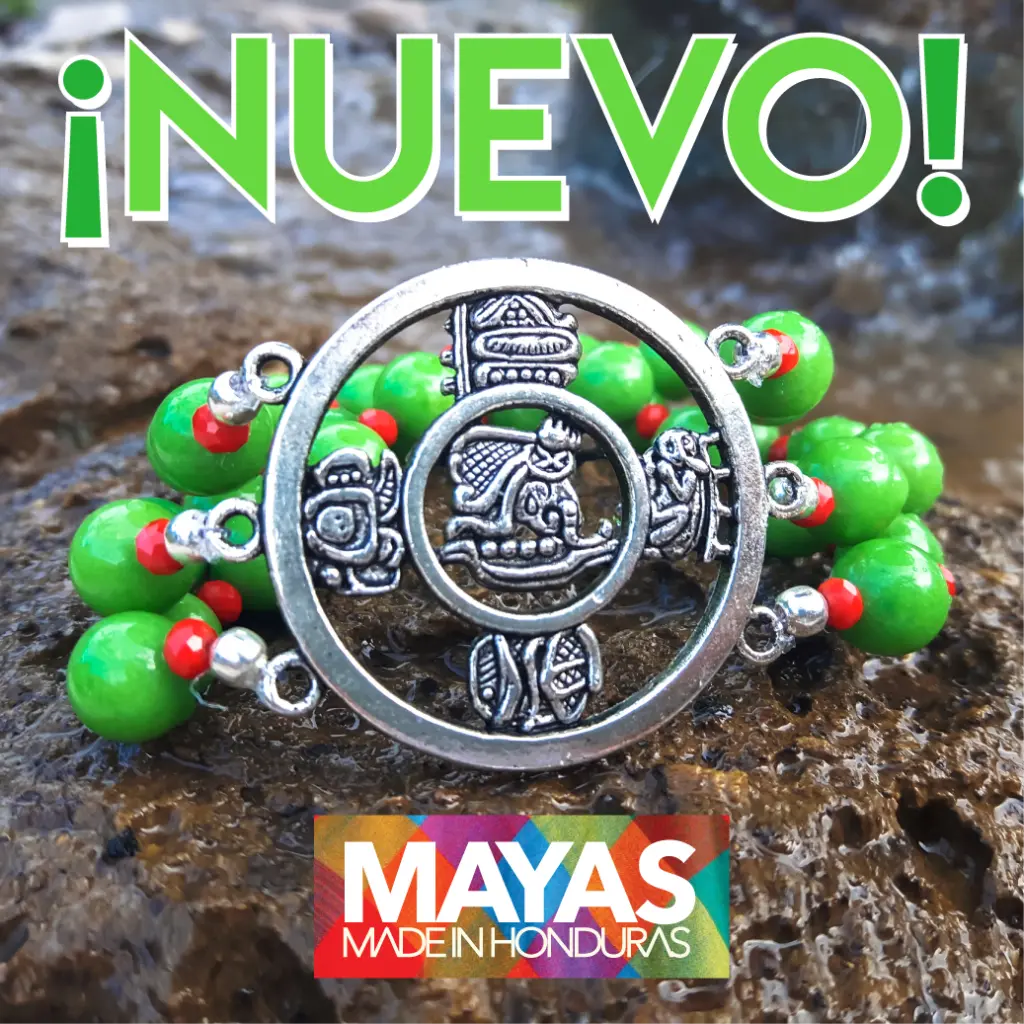
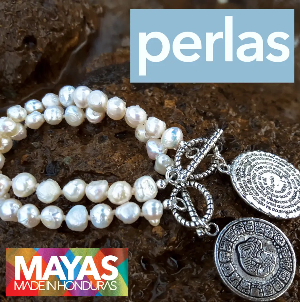
Each piece was unique, so I decided the best way to sell them was to let them sell themselves. An ad is the photograph with a short themed line of type over it, ready for Facebook, Instagram, or wherever else the client wanted it.
Dressing one up would only have hidden the detail the buyer was paying for.
Other promotional materials
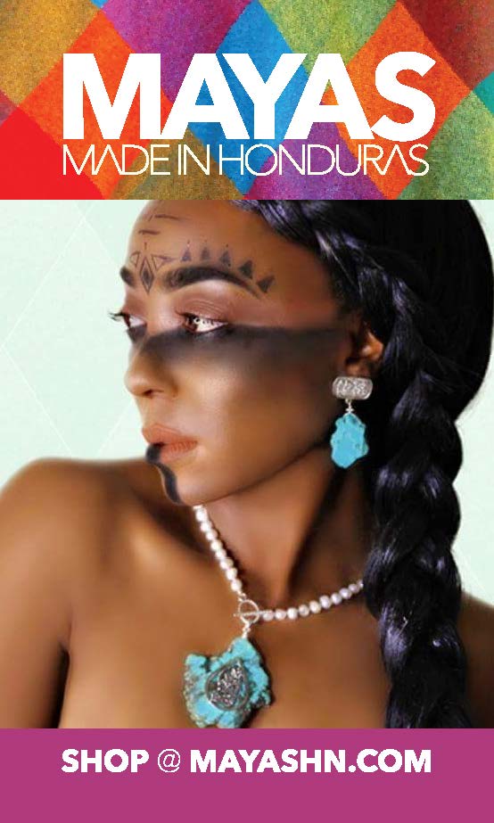
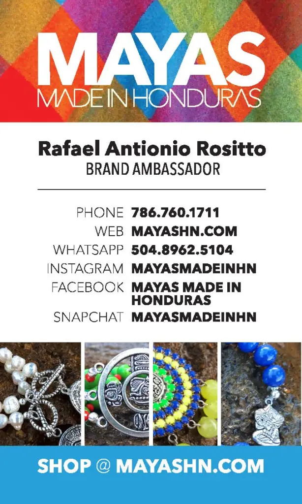
I drew the business card vertical, front and back, so it would stand out among the competition.
The first run was several thousand. Another thousand went to press shortly after, because the owner had given them all away at trade shows around the world.
What I kept
When the product is the thing that is genuinely different, design’s job is to get out of the way. Every piece of this brand, the mark included, was a backdrop for something somebody else made by hand.