
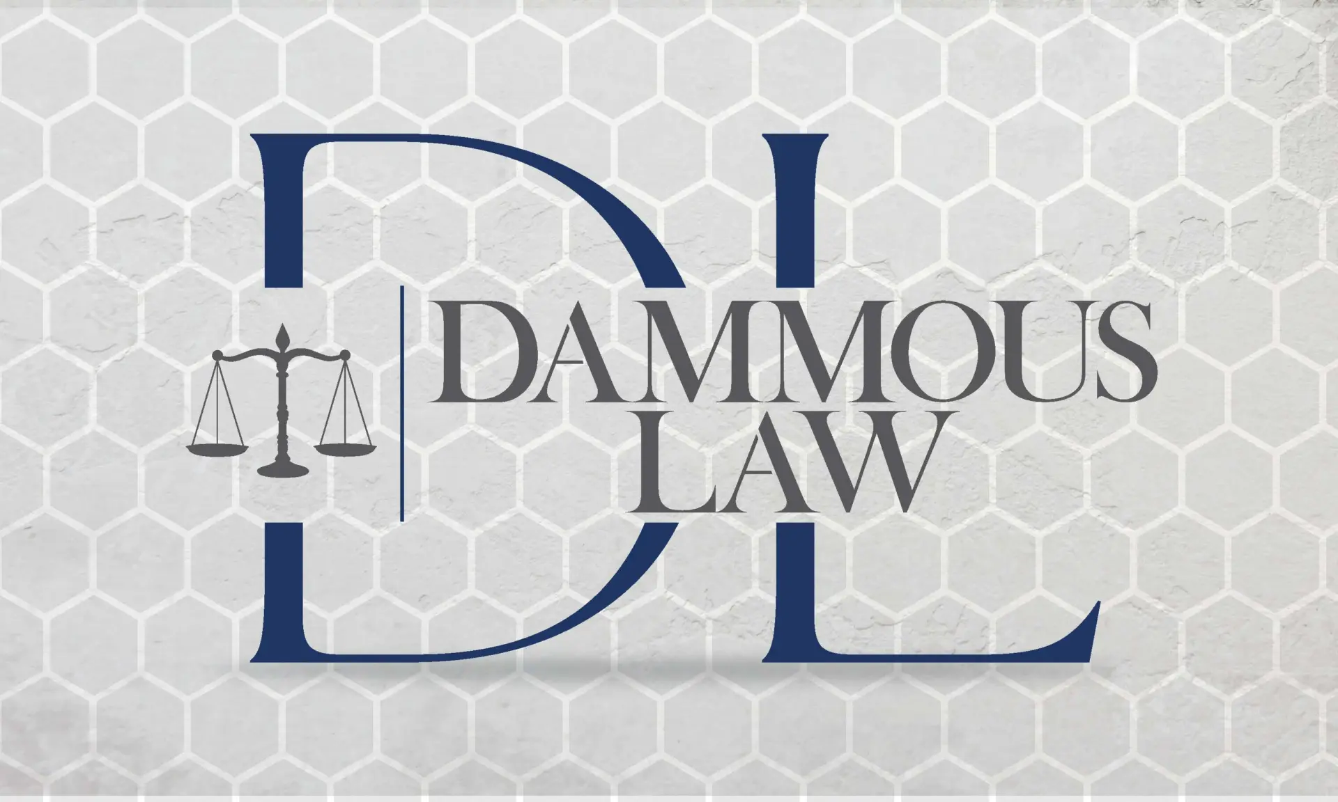
Dammous Law
The owner of the company I work for left it for law school. When he opened his own practice in South Florida he asked me for a logo.
It started small, a logo and a business card, and grew into posters, billboards, flyers and the signage in his office. The part worth telling is the first round, the one he turned down.
Creating the brand
A law firm mark usually looks like every other law firm mark: old, stuffy and tired. I started somewhere else. I drew a set with bold sans-serif type, bright color, and enough shading and depth to give the mark weight next to the rest.


He liked them. He also said they were a little too far against the norm. He was new in the business, and he thought the traditional route was the best approach.
I had been designing for what stood out. He is the one who has to hand the card across a desk. So I went back and drew the conservative version, and kept the modern edge in the details.


He chose the last one. That mark became the brand.
Creating the marketing materials
With the logo settled, the rest followed: business cards, advertising banners, A-frame posters for the sidewalk, and a run of social media ads.
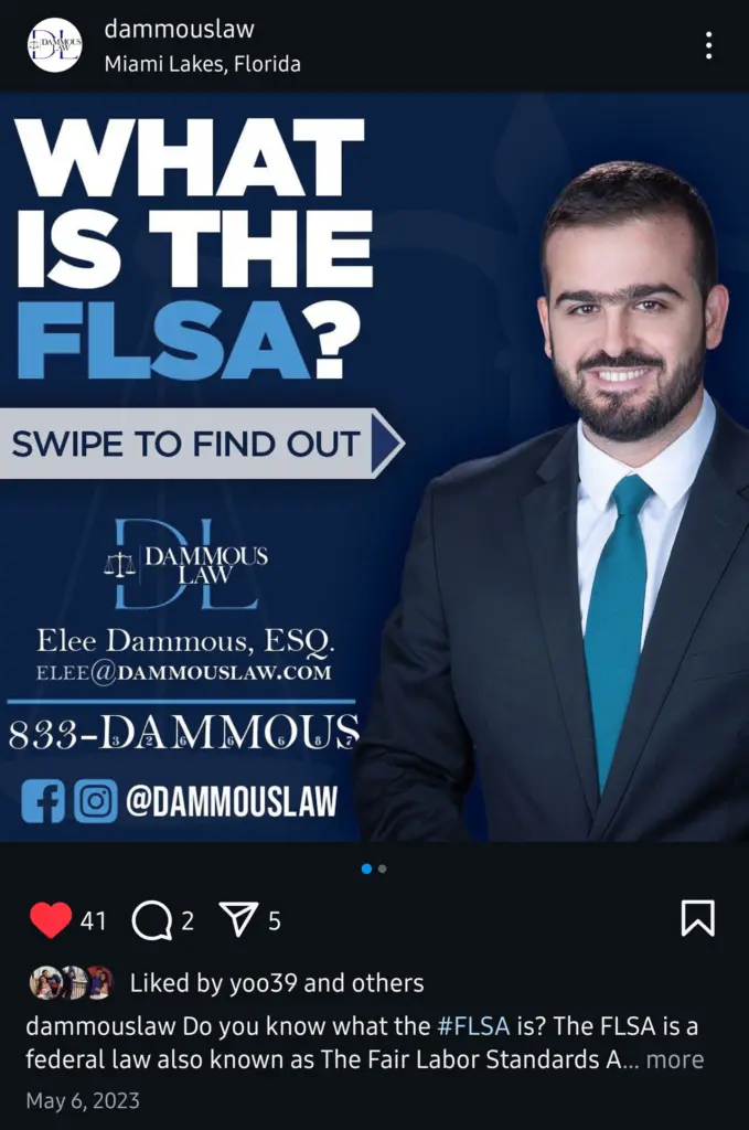
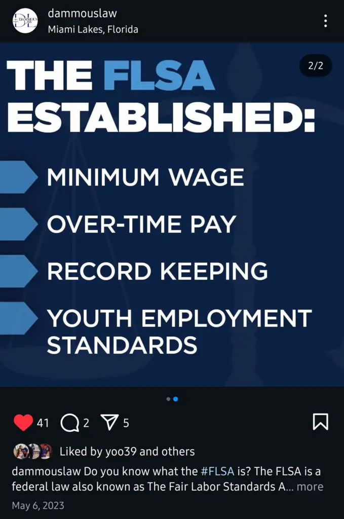

Then the big pieces, banners and wall decals for the office.
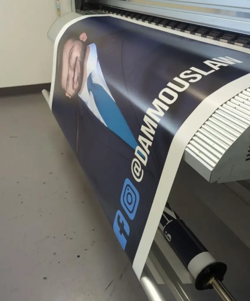
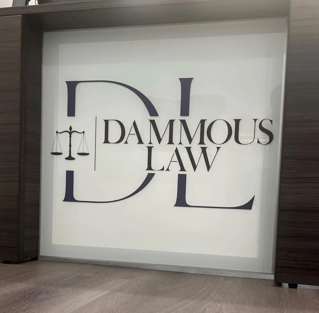
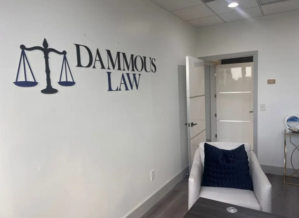
The modern marks never ran. The conservative one went onto the sidewalk posters, the office wall, and the card he hands across the desk. That is what I kept from the job: the client is the one who has to stand next to the logo every day, and he knew his room better than I did.