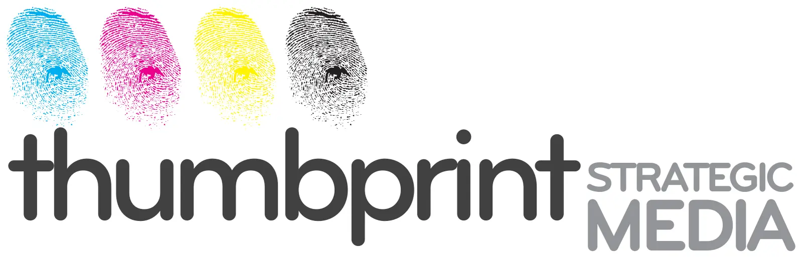
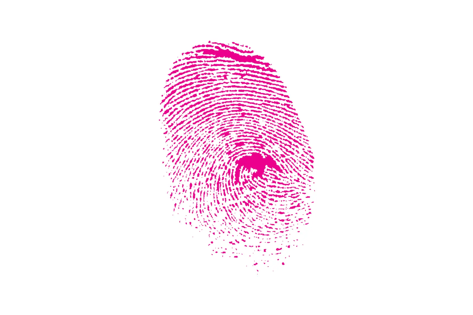
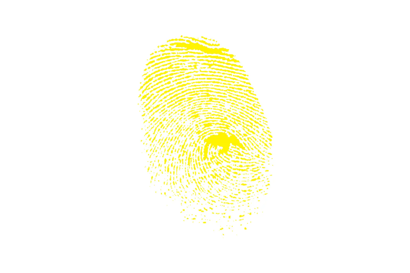
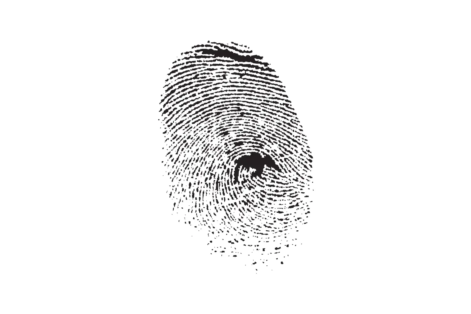
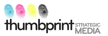
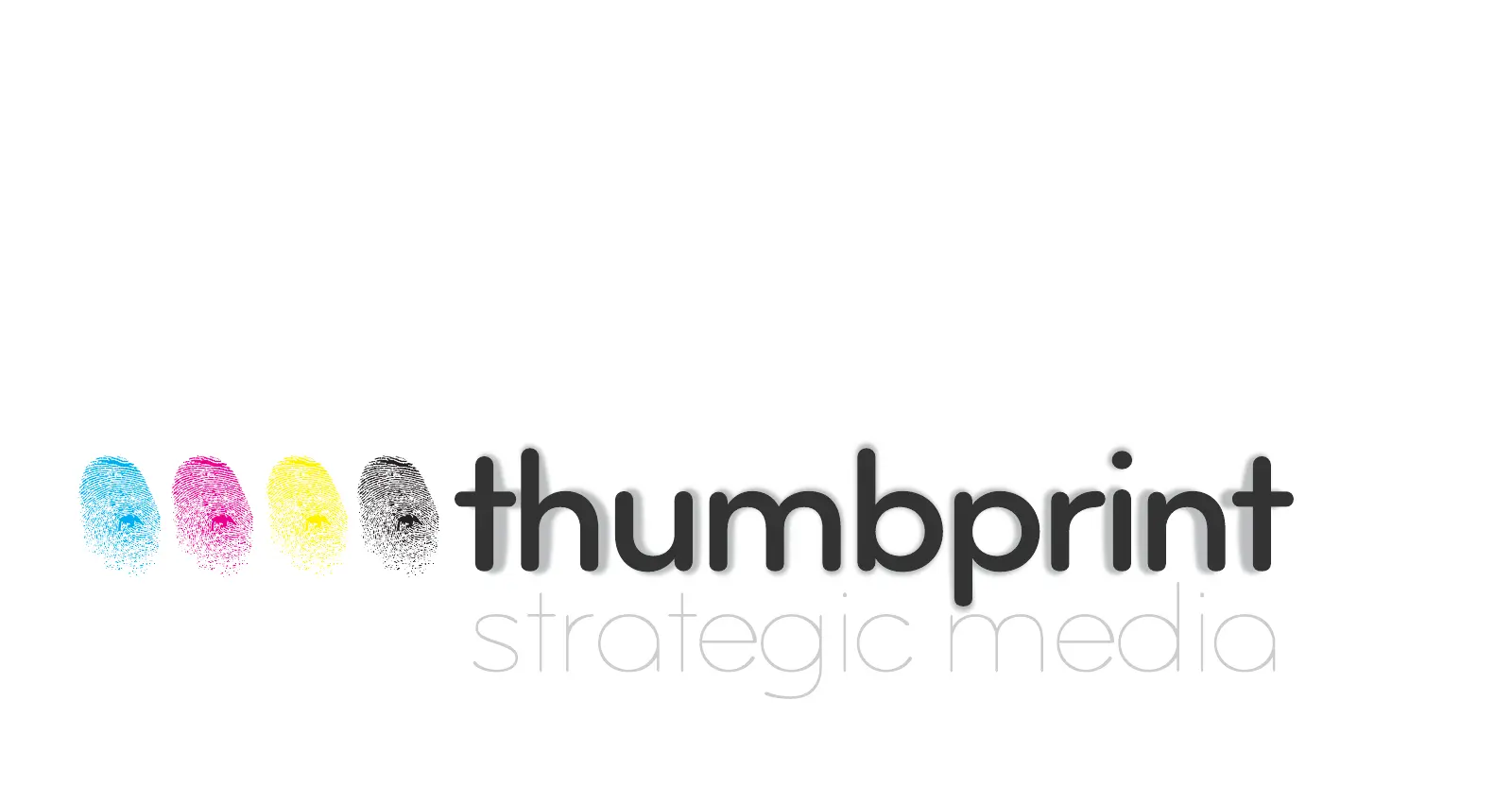
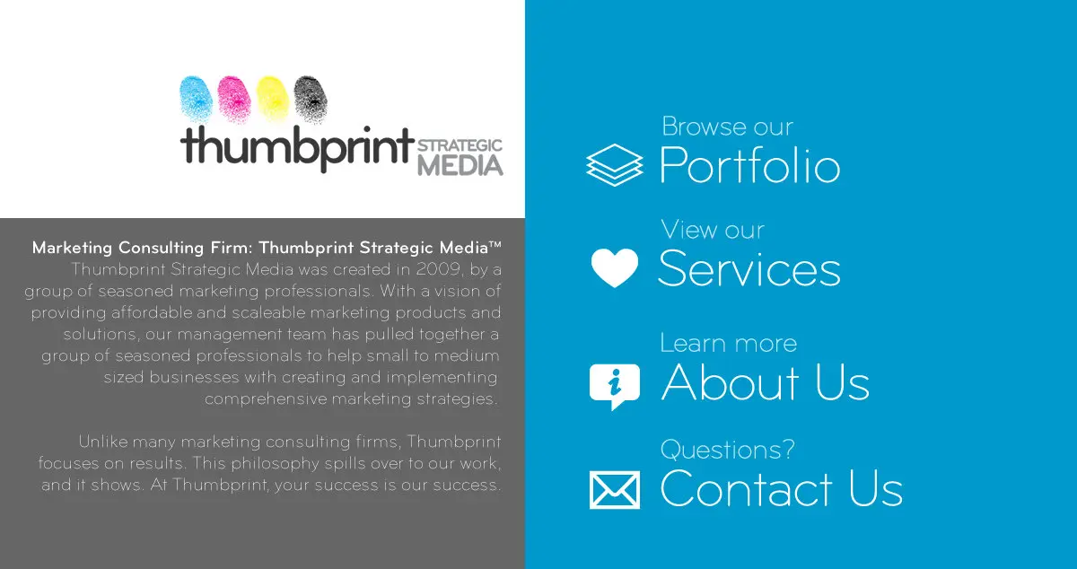
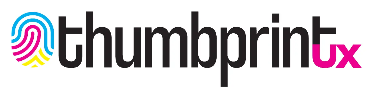
In September 2009 I lined up one thumbprint four times, once in each process ink. Those are the four a printing press mixes every other color from: cyan, magenta, yellow and black. The prints became the mark of Thumbprint Strategic Media, the marketing firm I worked at from 2009 to 2012. I was on a team of four there.
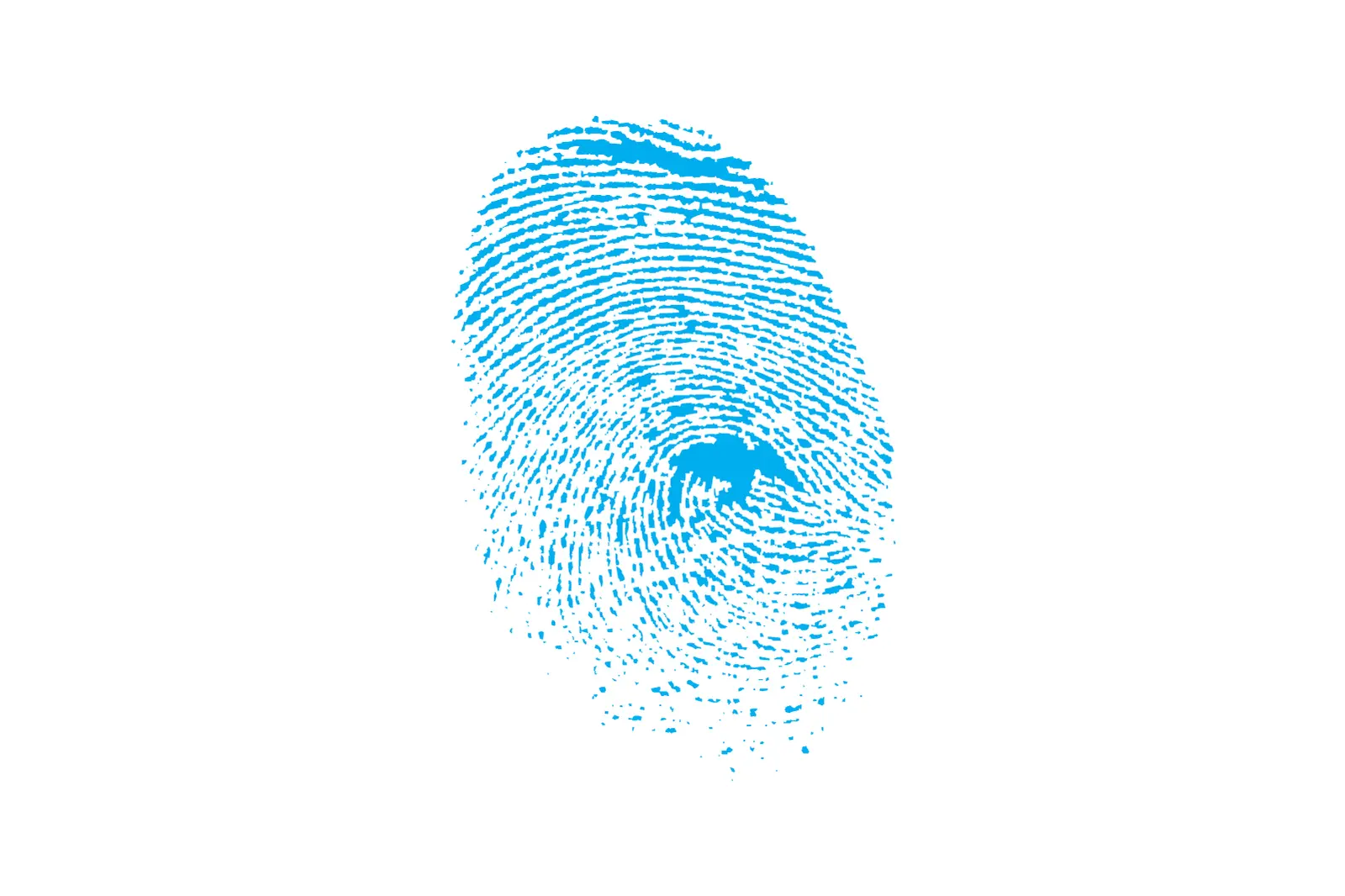
The print is my own thumb. I used a copy machine to print its basic form, scanned that back in and traced it in Illustrator to get the vectors. If anyone ever asked whether it was a real thumbprint, I wanted to say yes. Nobody asked.
This page follows the four inks. They got bigger, then they started to overlap, and by 2023 they’d opened into a full rainbow. The last version is the box that says i am, at the top of this page.
Dates and colors read out of the design files
- 2009
cyan
#00aeef - 2009
magenta
#ec008c - 2009
yellow
#fff200 - 2009
black
K100 - 2011
magenta
#ff0099 - 2011
cyan
#0fcdfd - 2011
yellow
#ffff00 - 2011
where waves cross
#bed52e - April 2023
the inks as one bar
4 stops - May 2023
green joins
#0ee94b - May 2023
the full spectrum
8 samples - Today
in this site’s code
#ec008c
One print per ink
The first mark kept the inks apart. There’s no mixing in it. Each print is 100 percent cyan, magenta, yellow or black, the word thumbprint is 90 percent black, and strategic media is 50. In 2010 I split the prints into four files, one ink each.
In October 2009 I tried the business card five ways. I stacked the prints in a column, set them in a row of ink squares, ran four thin ink rules across, and tried a black card with flourishes. My title on them was Director of Internet Technologies. Then I built print files for a colleague’s cards too. The street address and phone on mine, and the name and details on his, aren’t real. I repainted them with invented ones.
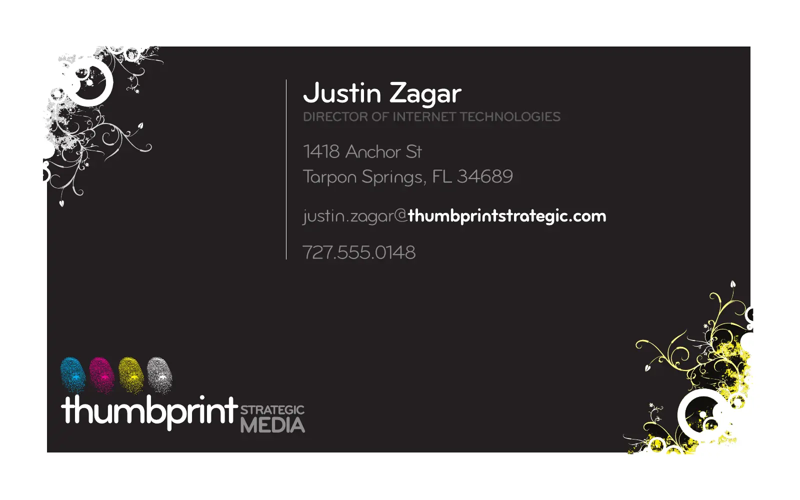
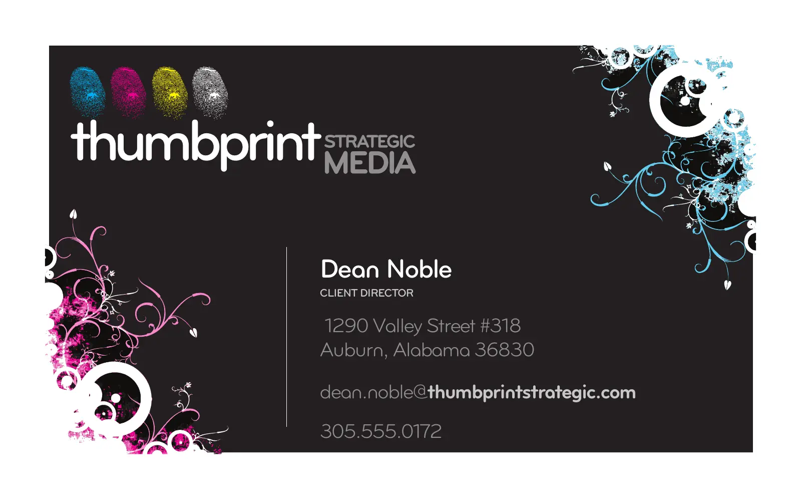
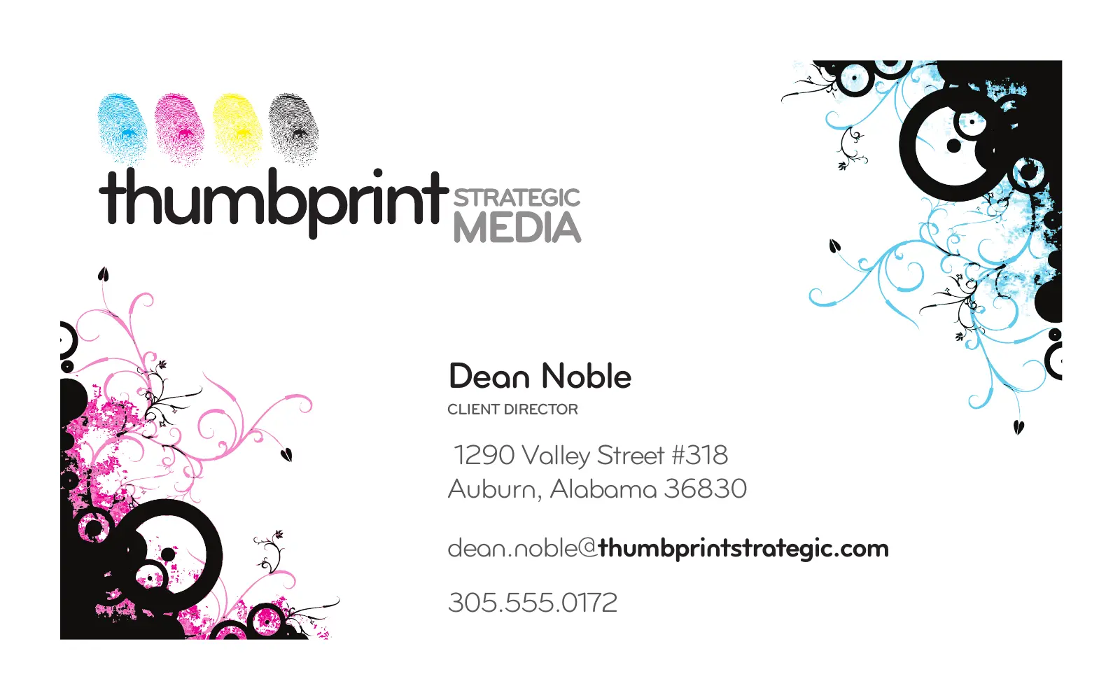
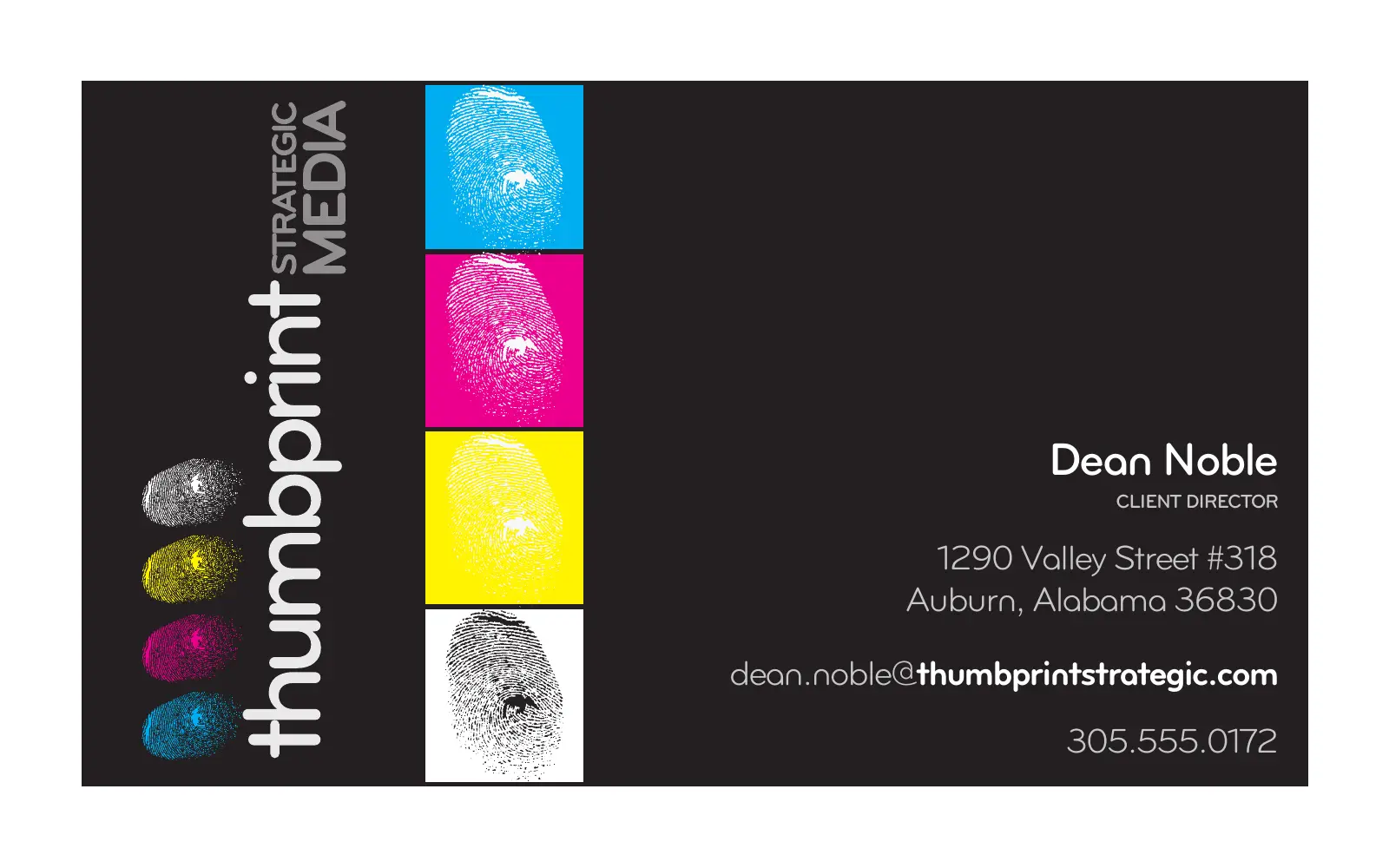
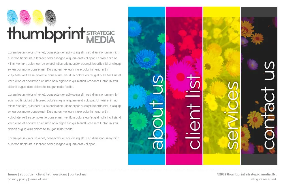
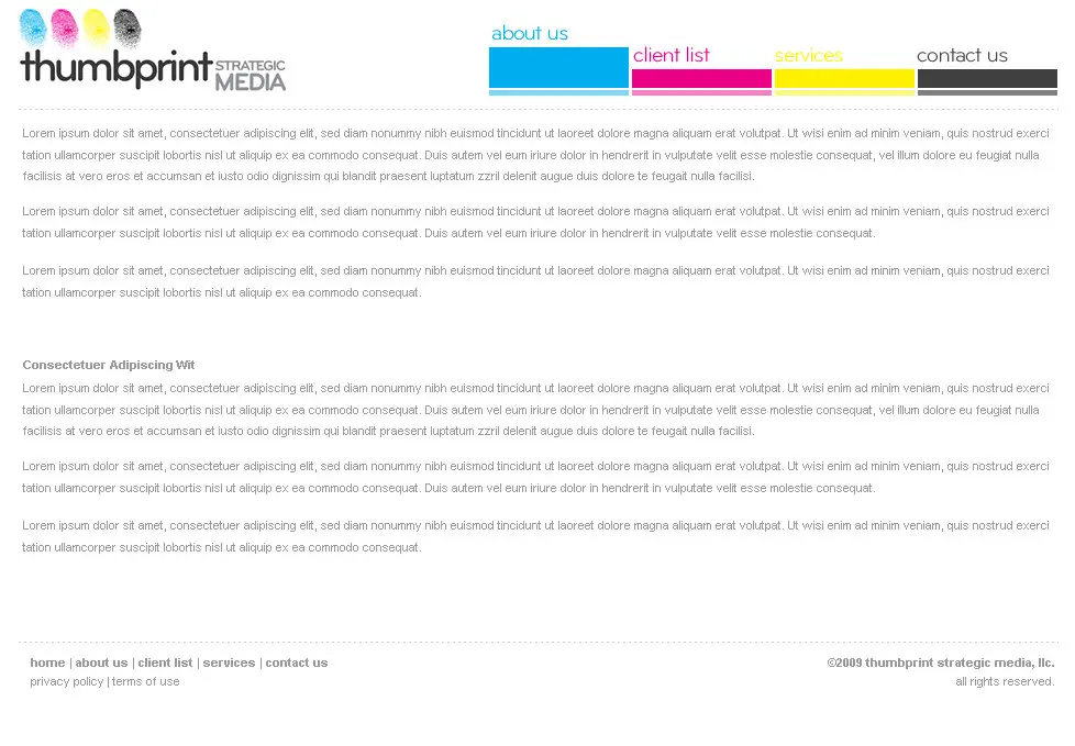
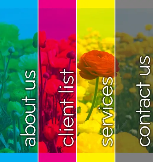
The first website put the inks in columns. Four tall photographs, each washed in one ink, with about us, client list, services and contact us running up them. On the inside pages the columns shrank to four thin tabs.
The products got one ink each. On November 6, 2009 I drew five product logos in one sitting: clientPrint in magenta, sitePrint in cyan, a lite version in a paler cyan, imPrint in orange, and chatterbox. Even the orange is process ink. It’s half magenta and all yellow. Two more followed in 2011.


Four prints start to become one
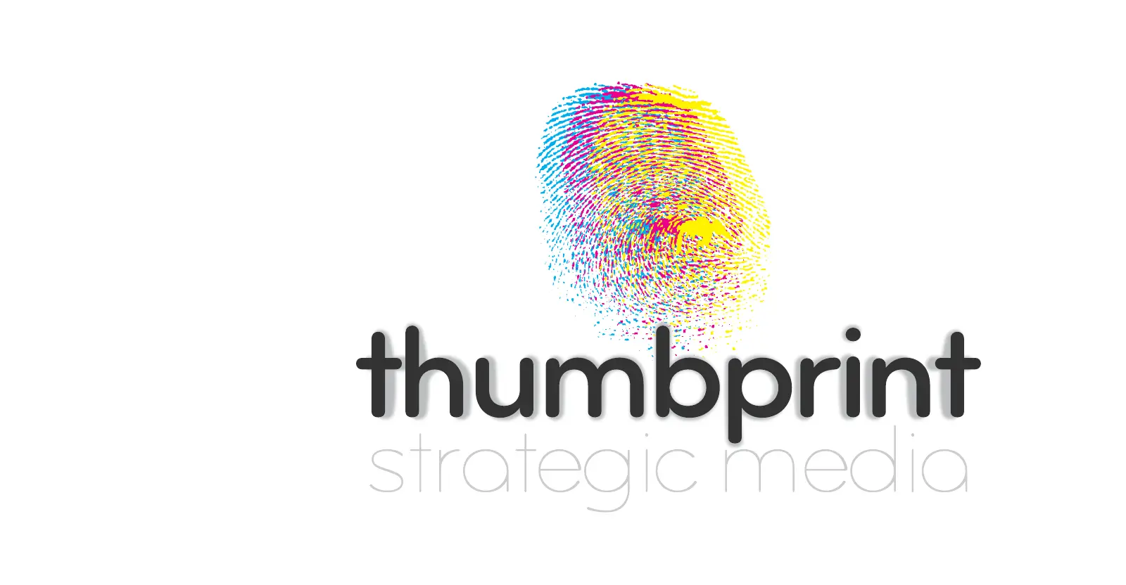
In January 2011 I started pulling the four prints into one. Strategic media dropped to light grey lowercase. I tried the mark three ways: four small prints, one print overprinted in every ink, and one print banded magenta, yellow and cyan.
The second site, in February 2011, gave each ink a photograph of its own. A dandelion sat on a cyan sky, a black stone on pale yellow stones, a frangipani on magenta petals. A magenta band under them carried the newsletter sign-up.
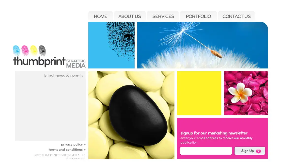
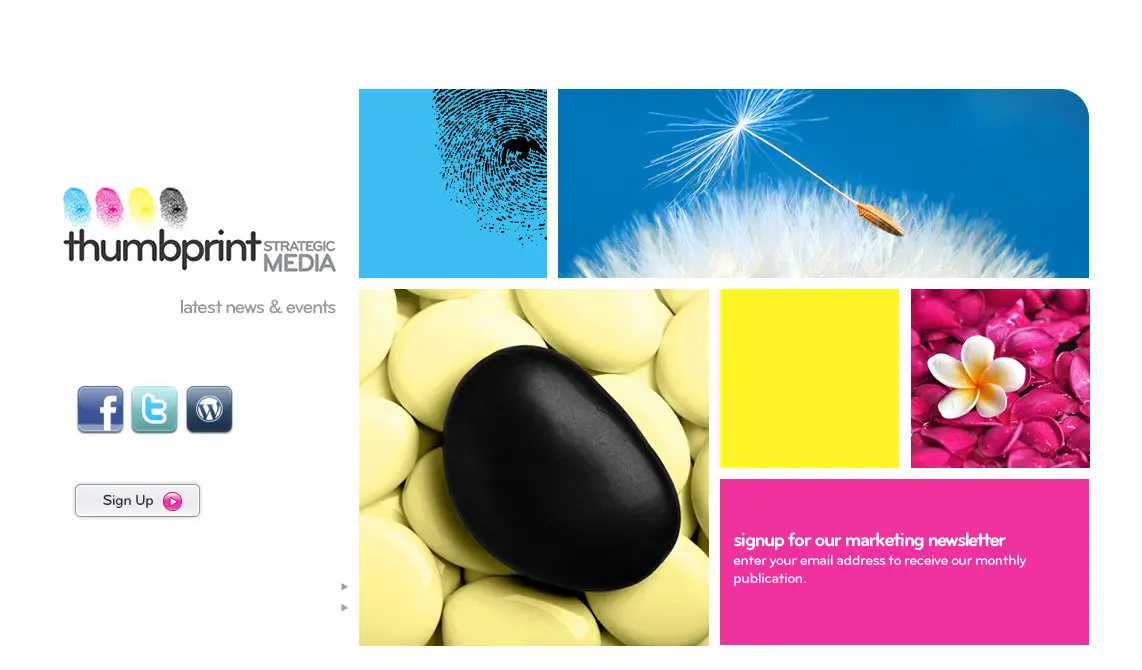
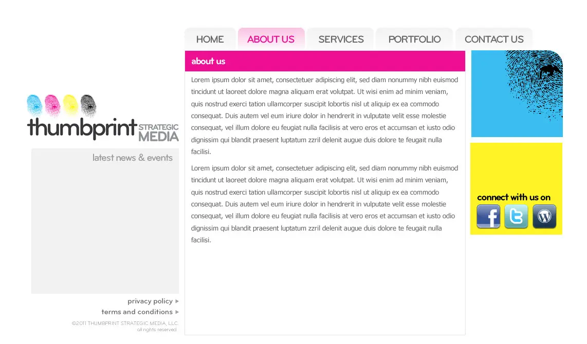
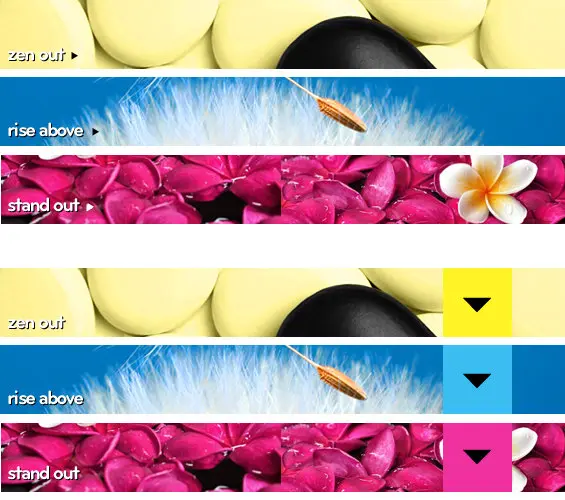
The February 2011 site runs again. It ran on Imagine, the publishing tool I’d built, and you can open it below.

The inks overlap
In September 2011 the inks turned into translucent waves behind the whole site. Where two waves crossed, they made a color neither had on its own. Yellow over cyan came out a yellow green, #bed52e.
I went through nine full layouts between August 30 and September 30. The September 27 version went live. The layout wall shows an earlier one, from the 11th.
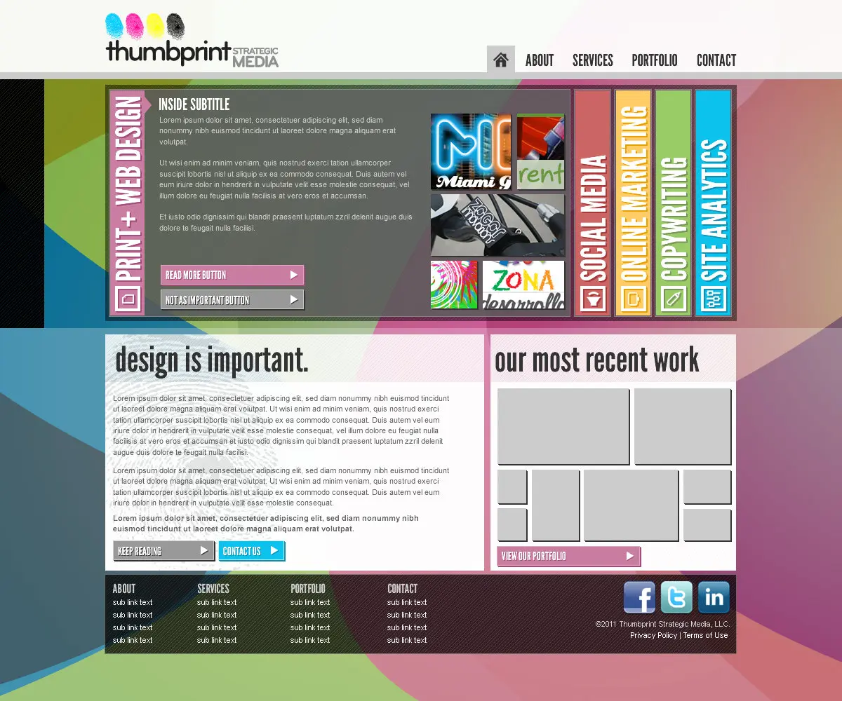
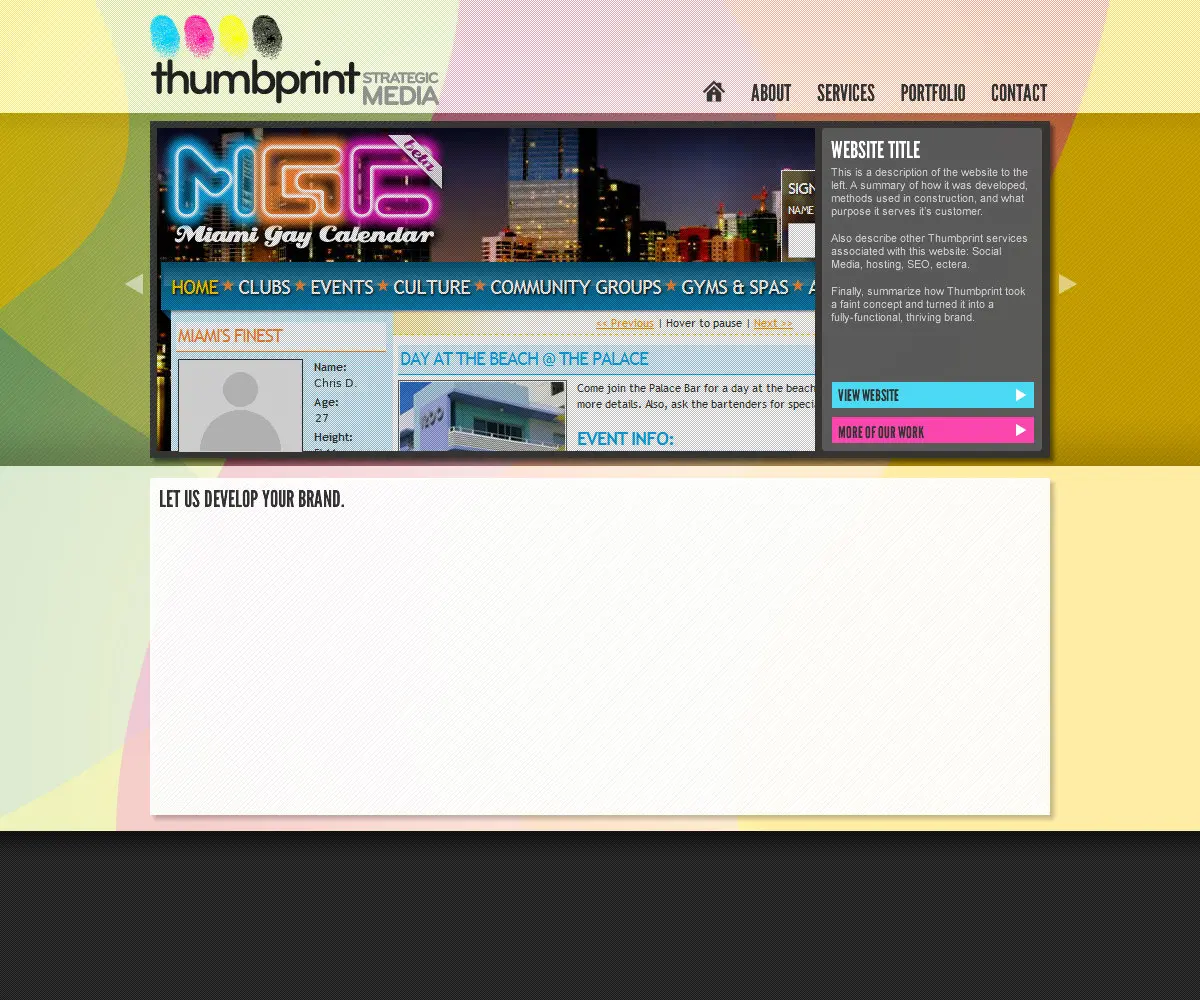
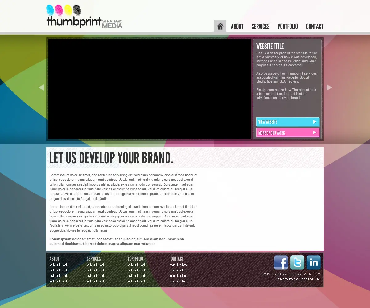
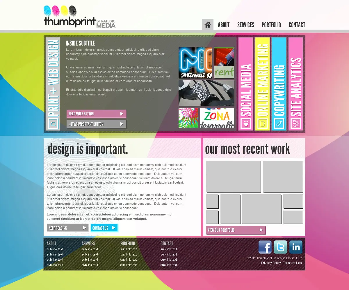
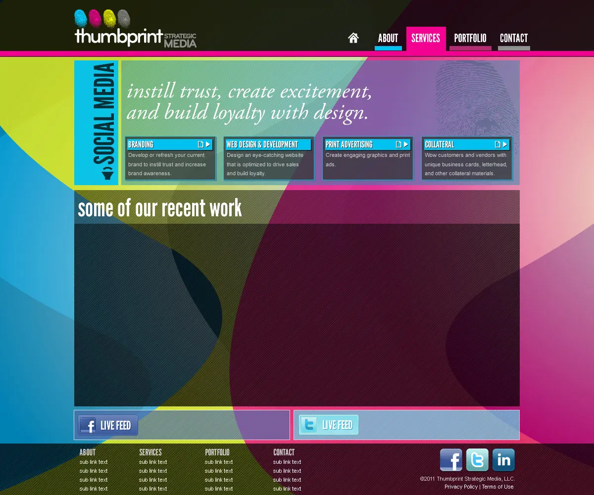
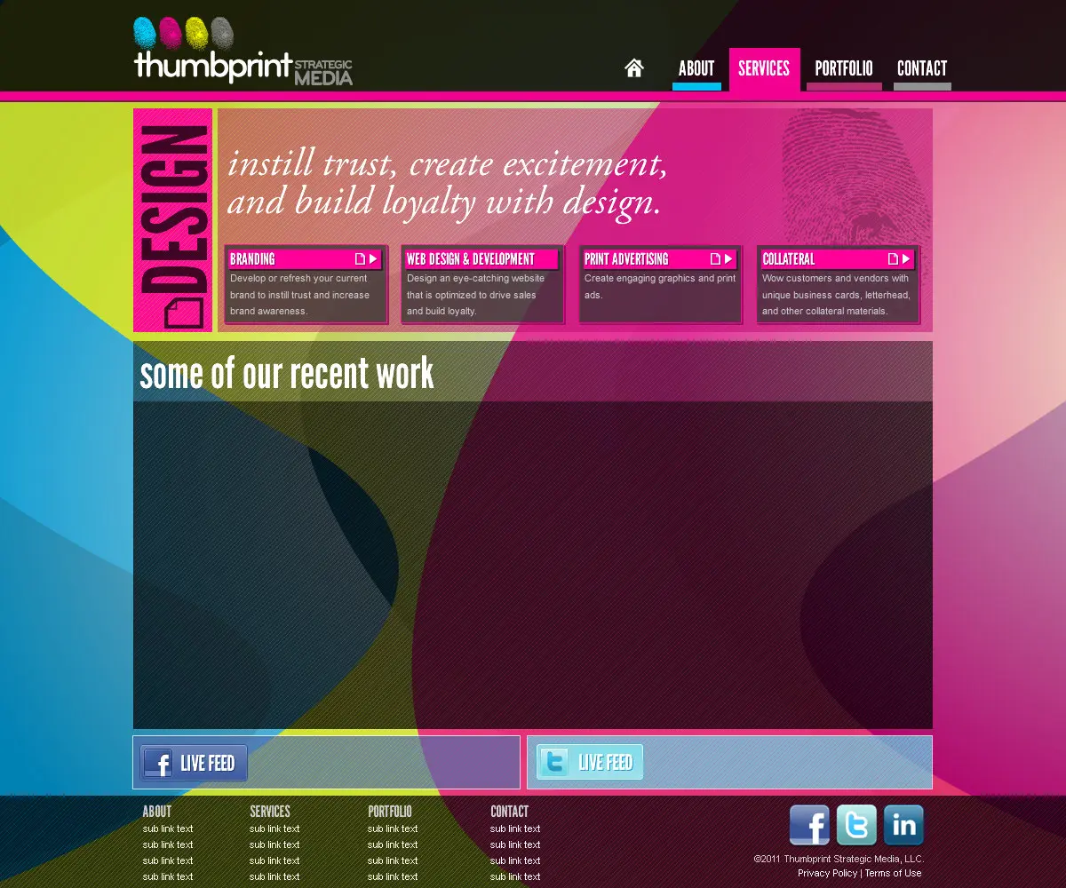
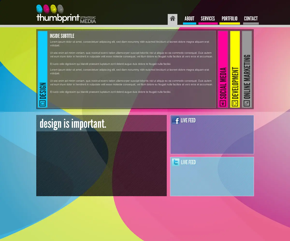
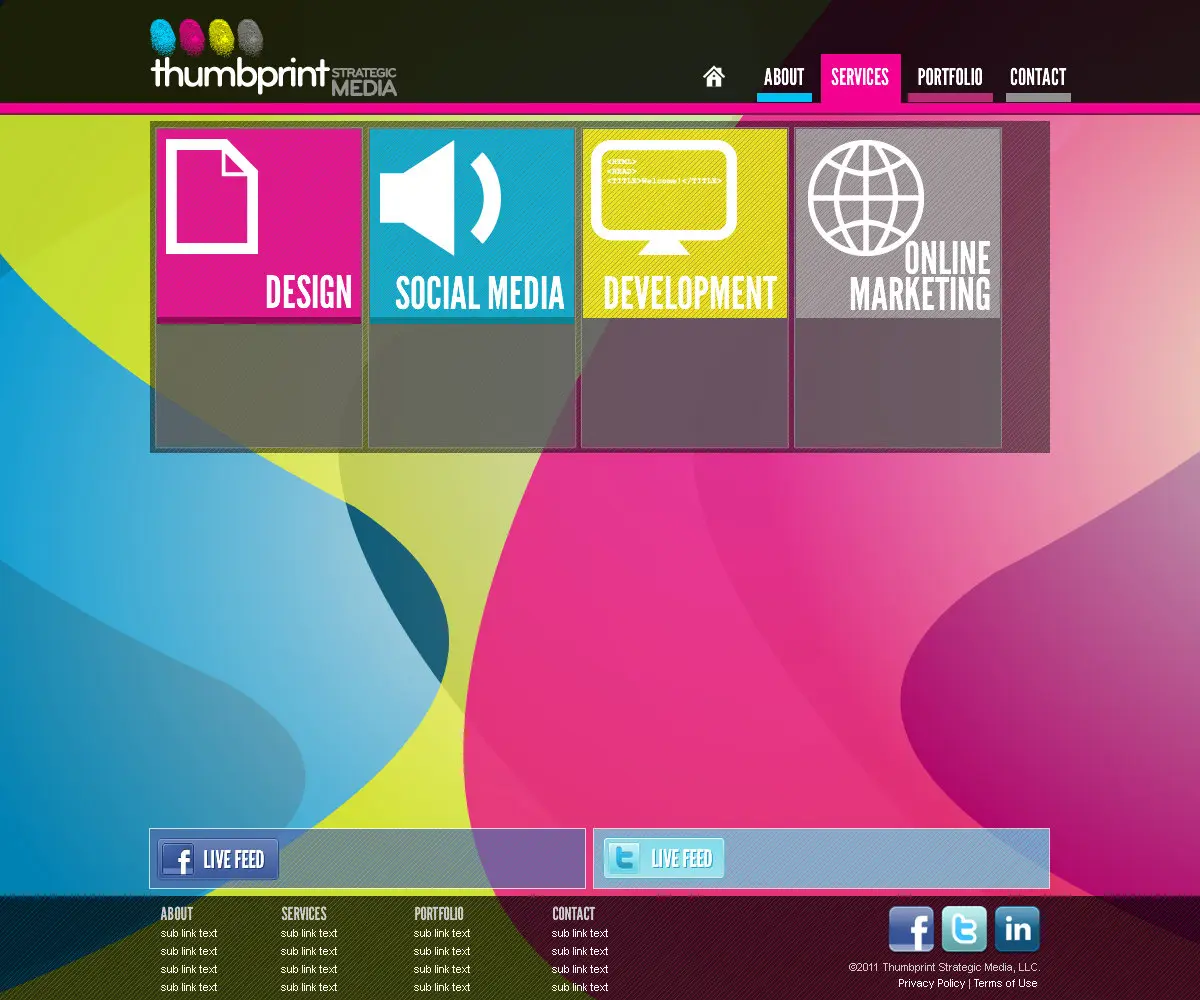
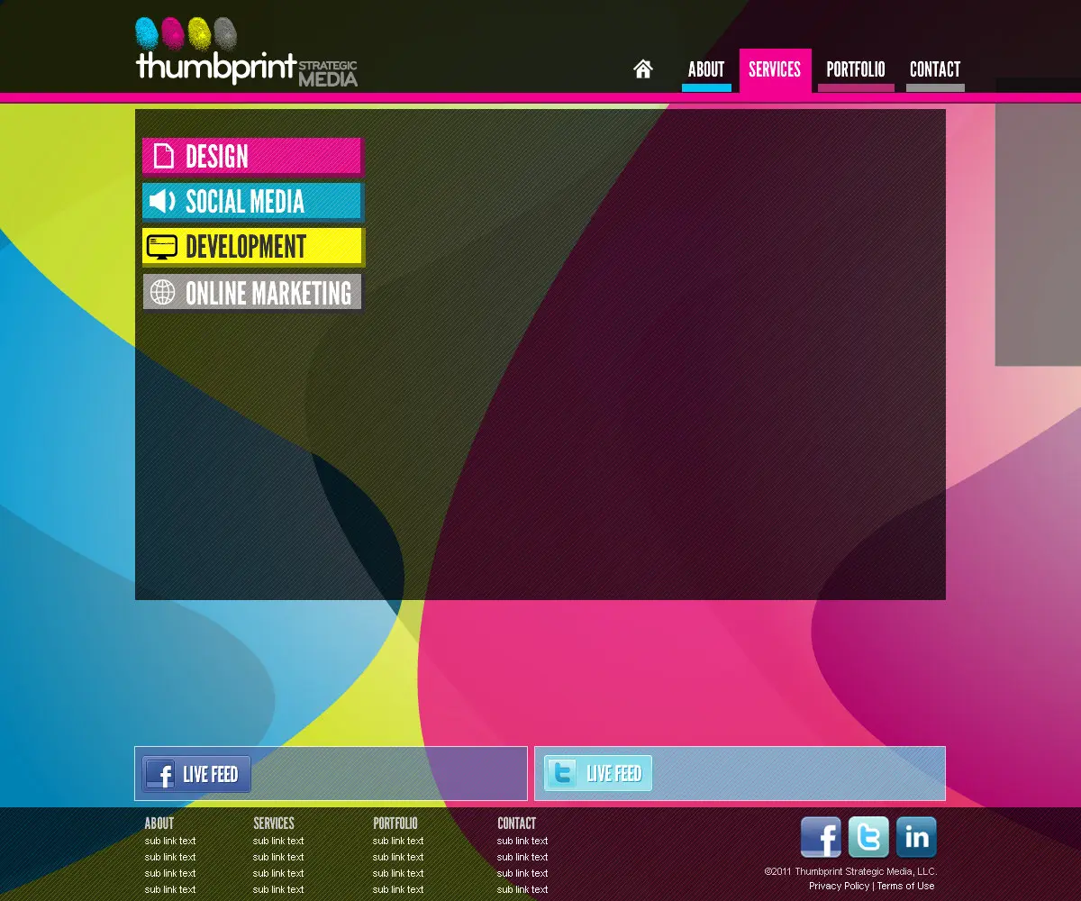
The section labels ran up the columns in League Gothic, one ink to a column. Those column colors, #ff0099 and #ffff00, are the hot magenta and the yellow in my design language today.
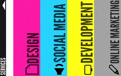
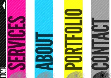



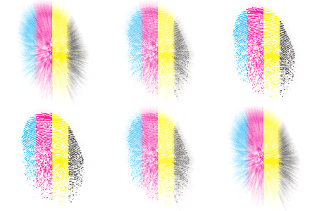
In October 2011 I split one fingerprint into four bands: cyan, magenta, yellow and black.

Cards, sheets and a pitch
The print followed the screen. The 2011 card is the waves with League Gothic over them, and the letterhead’s nothing but one ink rule across the top.



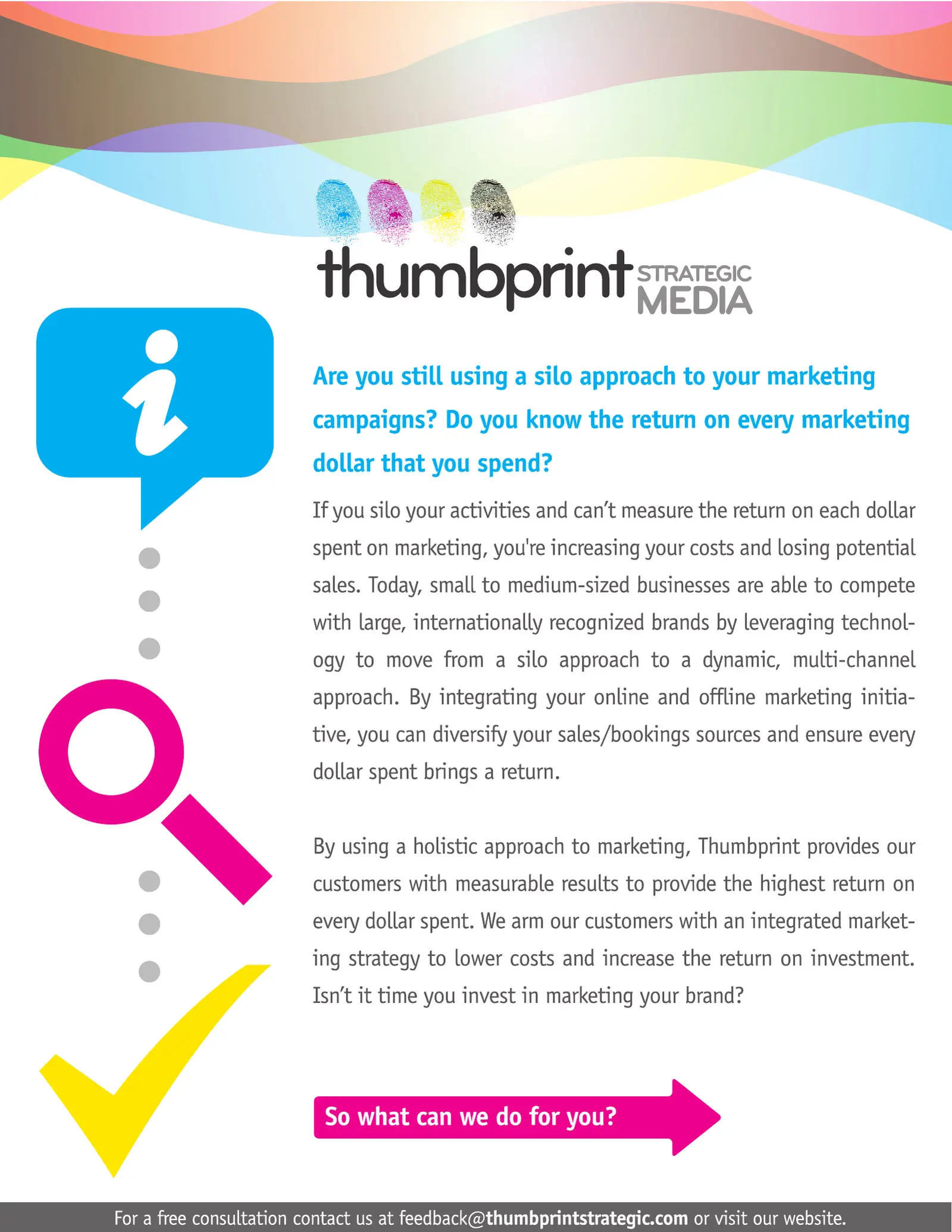
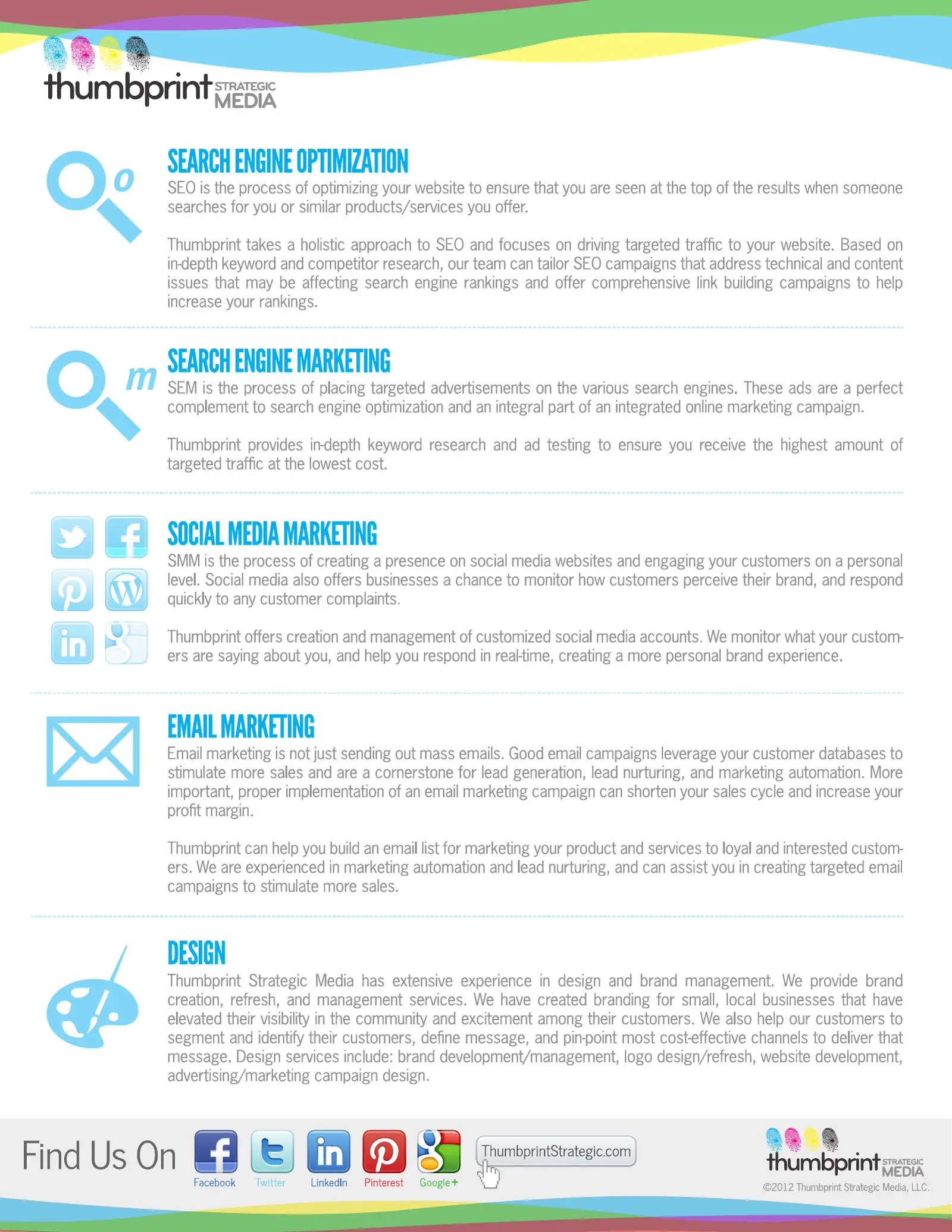


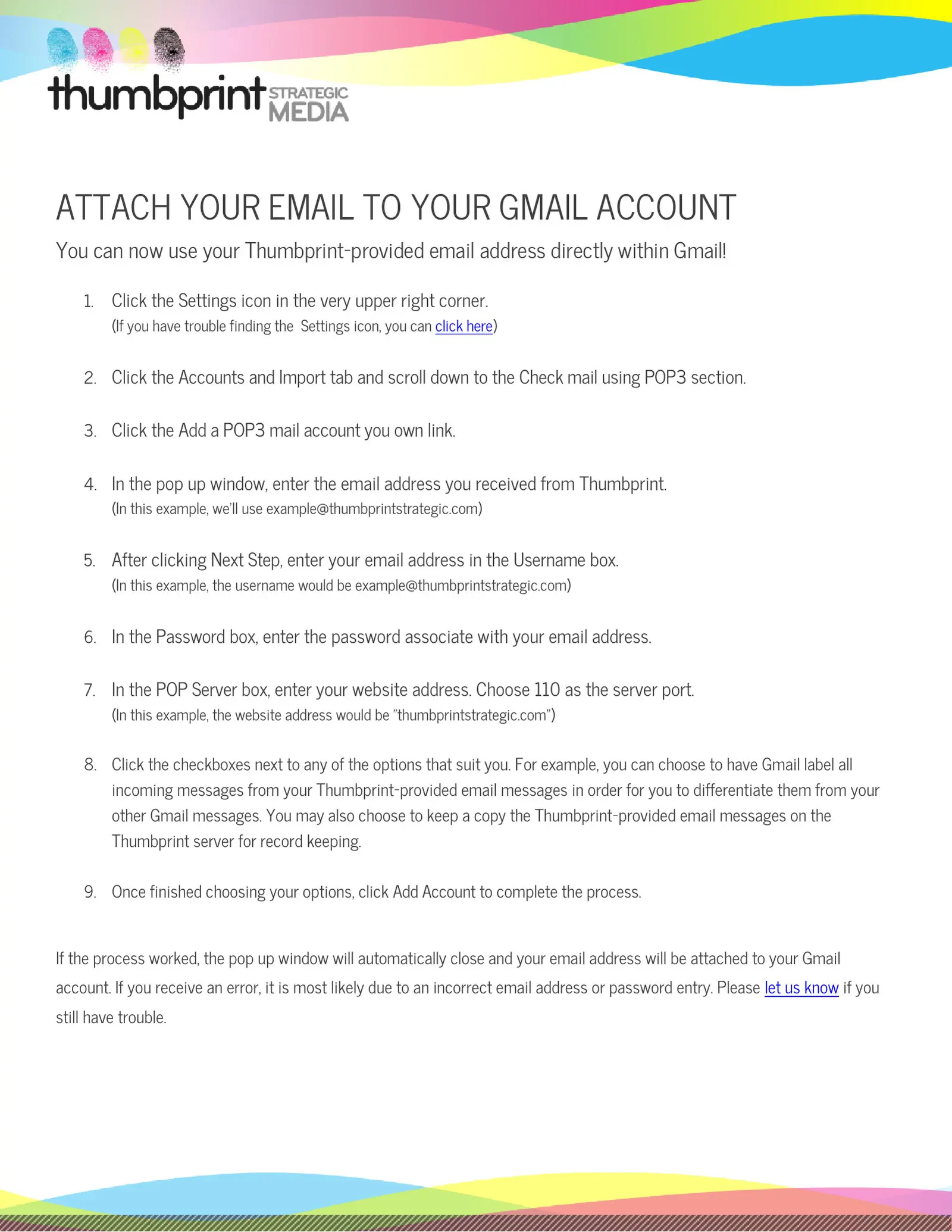
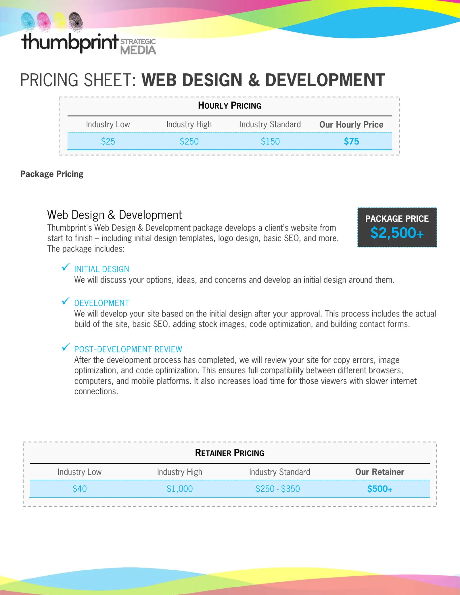
The everyday paper got the same treatment: a sheet walking clients through adding their email to Gmail, and four pricing sheets on one template. The prices are the firm’s, from April 2012. The web package started at $2,500, and the SEO and social media packages at $750.


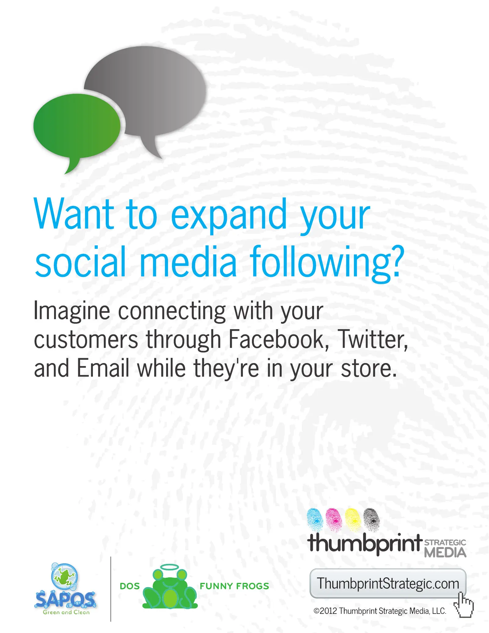
The FoxNOW sheets were a pitch to Fox Rent A Car in the spring of 2012. It didn’t sell, and Fox was never a client. The fingerprint ground and the mark in the corner are Thumbprint’s.


Motion and social
In May 2012 I animated the four-band print. It blurs out and snaps back into focus. The single-ink versions do the same with a dark print on a colored ground.
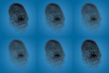
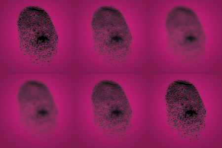
The social pages took the cyan. A contest got its own name, Social Print, in the same pattern as the 2009 products. The newsletter and support headers turned the ink into a paint splash, in the same cyan and magenta as the 2010 web logo, #1badcf and #f82790. And a small Developed by Thumbprint stamp went in the footer of client sites.



Made under this mark
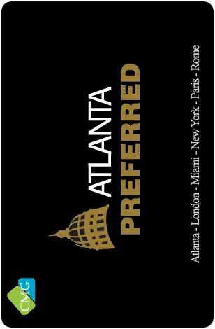
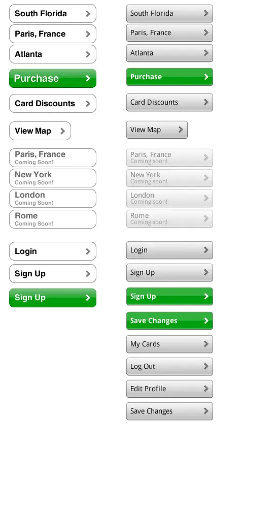
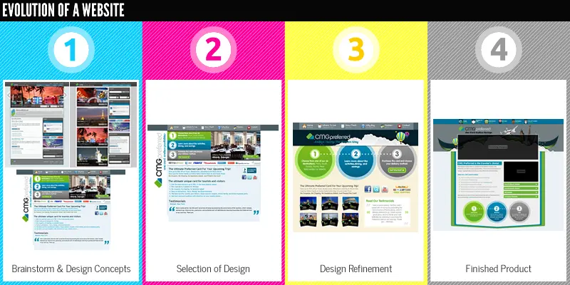
Not all of the work was in Thumbprint’s colors. For CMG Preferred I designed and built a mobile app for iPhone and Android, a hosted web app wrapped for each platform, published in August 2011. The CMG mark wasn’t mine, but the screens, the per-market cards and the button set around it were.

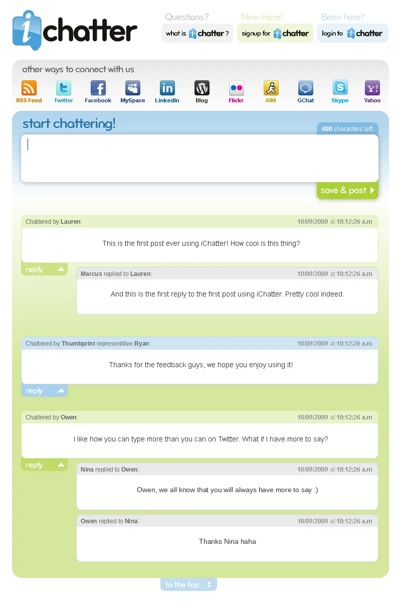
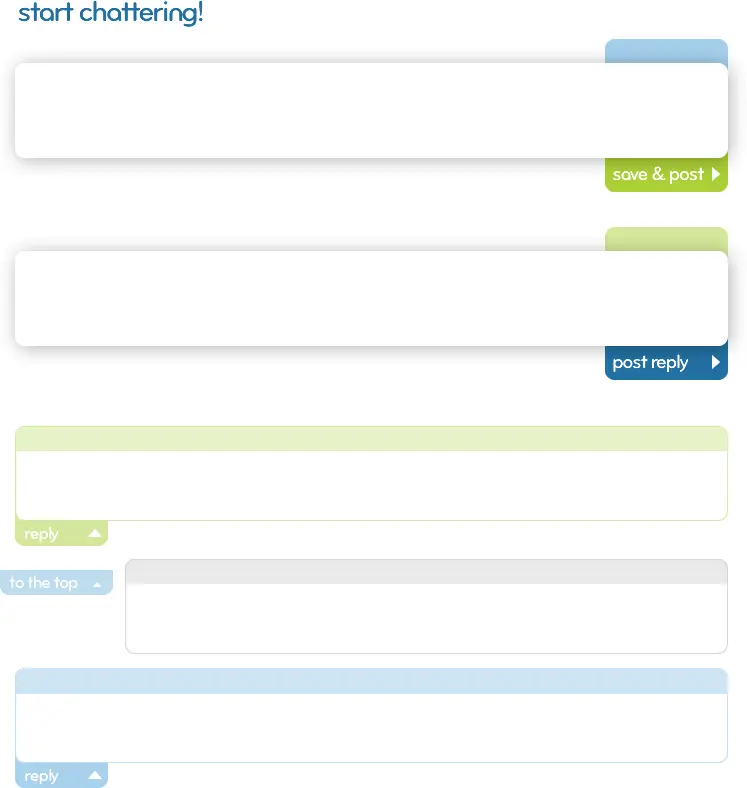
I designed iChatter, a comment system, in October and November 2009. It had a character counter and one obvious action. Two of the 2012 sales sheets put clients’ names beside the Thumbprint mark.

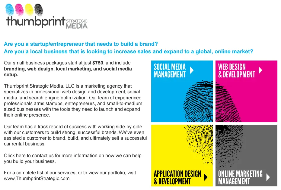
A Craigslist ad from April 2012 set the firm’s four services on ink tiles, with one print running across all four. Its line about helping a customer “ultimately sell a successful car rental business” is about iTravel.
The name comes back
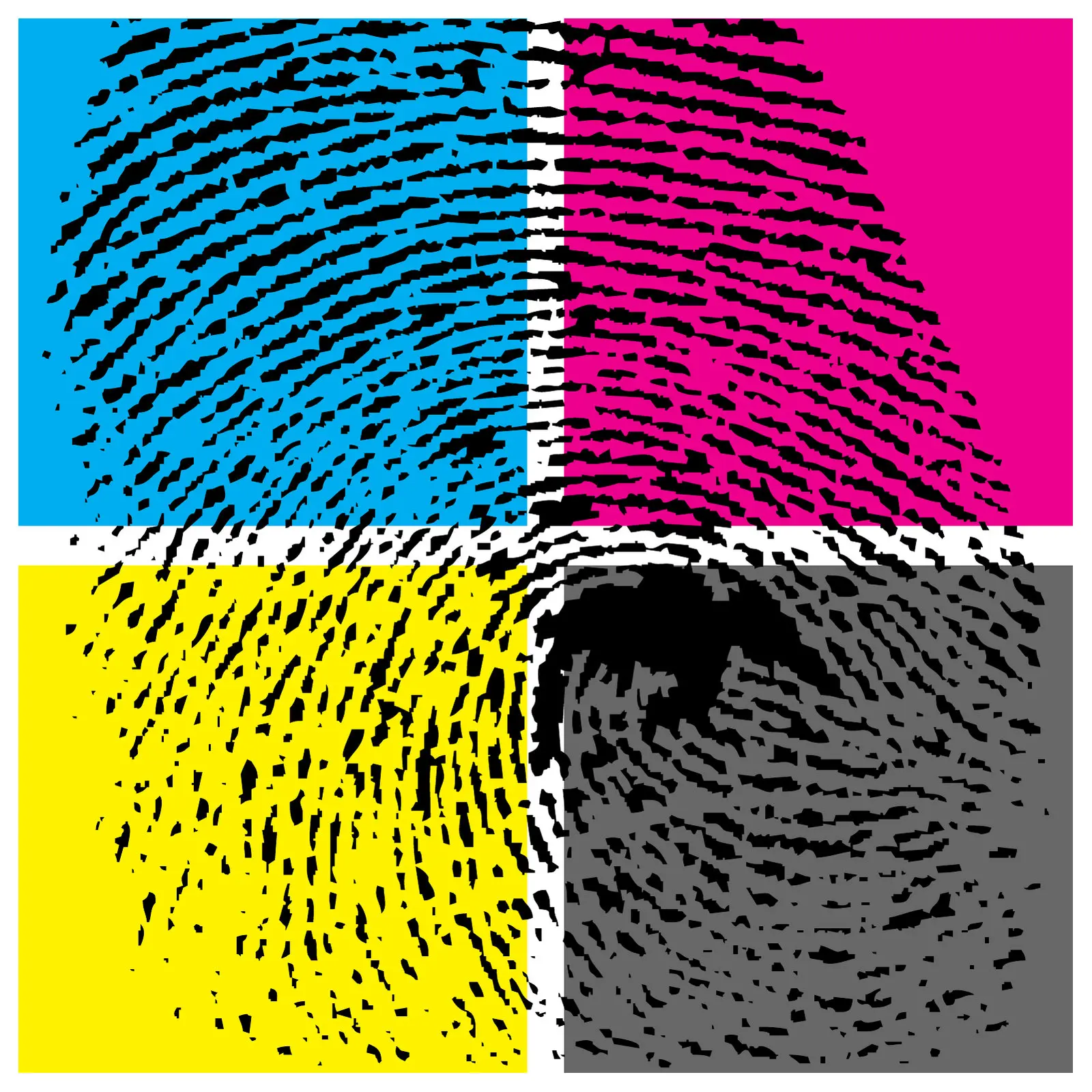
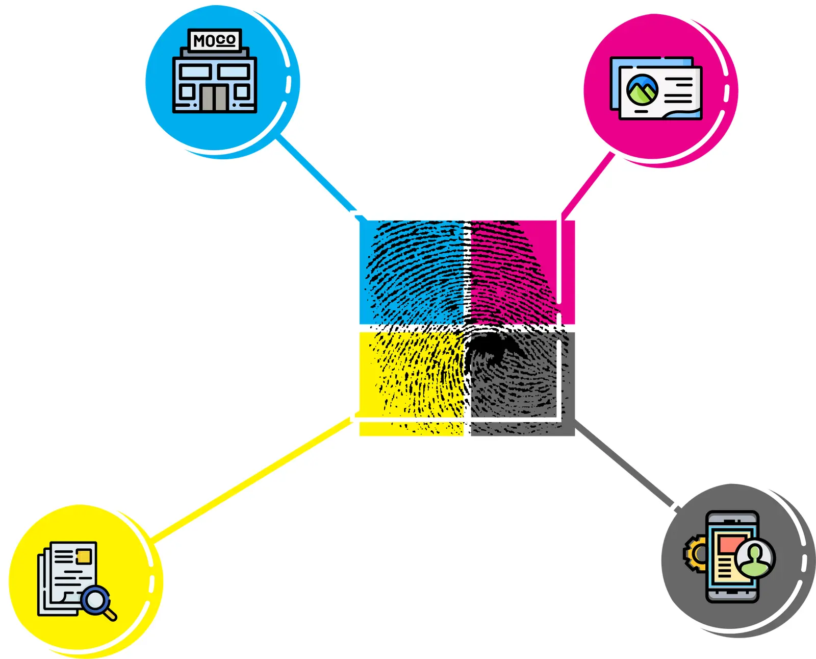
I picked the name up again in April 2023, for my own portfolio, and called it thumbprintUX. The first pieces went straight back to the four inks: one print cut into cyan, magenta, yellow and grey quadrants, and the 2009 inks laid out as a single bar.

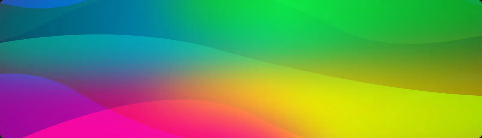
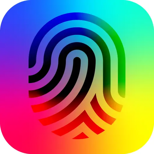
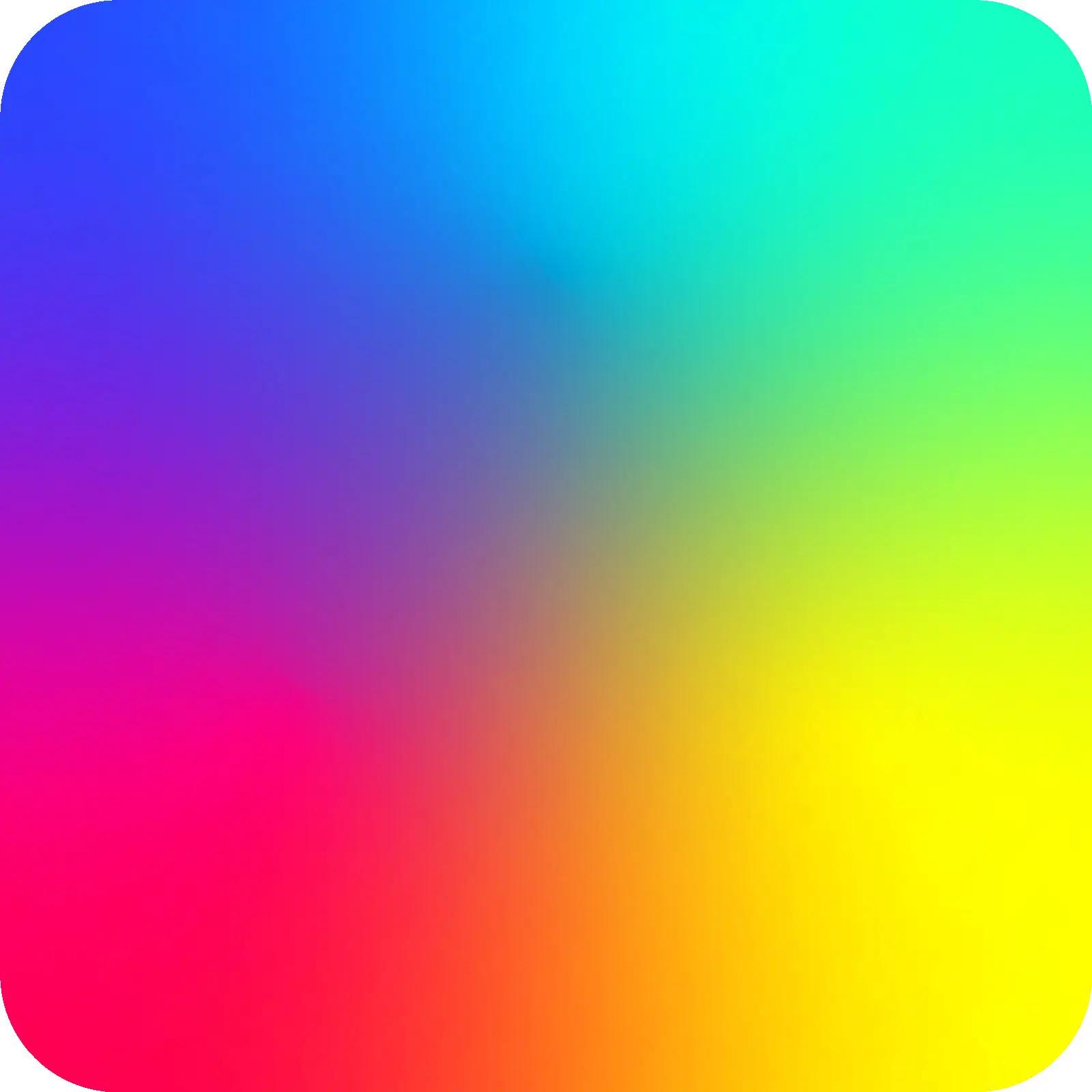
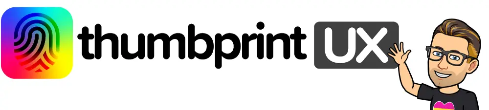
Then a green showed up. On May 13, #0ee94b joined the inks in the hero art, and four days later the whole spectrum came in. The print turned into a line mark on a rainbow tile. I started that one from an icon, not my thumb.

Where the rainbow went
Those were experiments, made before I’d settled on my own name as the brand. When I did, I kept the rainbow.
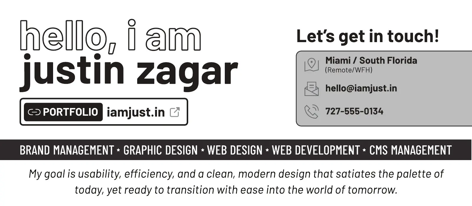
My resume in September 2023 already opened with hello, i am, in rainbow outline type, above my name. By February 2025 it’d gone grey and pointed here.
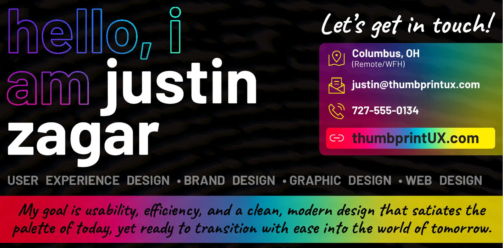
The rainbow ended up in the box that says i am, at the top of every page on this site. It’s from the 2023 tile. And the 2009 magenta’s hex, #ec008c, is in this site’s stylesheet too, as the first stop of a gradient.
The marks are on the logo wall, and the September 11 layout is on the layout wall.