
The idea was not mine. The man who owned the tire shop I worked at had been turning it over for a while: you walk into a store the size of an airfield, you need one thing, and there is nobody to ask. His answer was kiosks stationed around the building, or tablets clamped to the shopping carts, so the store could answer for itself.
He described it. I drew it, and then I built it.
Nine days in July 2015, start to finish. A logo, nine screens, and a working page on a real server. Then nothing. It was aimed squarely at Walmart and it was never shown to anybody.
Times read from inside the Illustrator files and from the Dreamweaver upload records
An unsolicited concept, drawn on my own time. Walmart never commissioned it, never saw it, and has no connection to it. Their name and mark appear here because they were the intended customer and I drew the kiosk as though it were already installed.
Nine days in July
Every file here still carries the moment it was made, inside the file rather than on it. Illustrator stamps a creation time into the document itself, and Dreamweaver kept a log of every push to the server. A file copy destroys the dates on disk. It does not touch either of those.
The logo came first, on the evening of July 3. Not a wireframe, not a flow chart, not a list of requirements. A logo, for a product that did not exist, a full day before the first screen. I am not going to defend that as method. It is just what I did, and it is what I would probably do again, because naming a thing makes it real enough to argue with.
The next day was the Fourth of July. I spent the holiday drawing five screens: the home screen at 9:02am, search at 10:56am, results at 11:46am, and the two assistance screens that afternoon.
On July 7 at 11:48am I made three files inside forty eight seconds. That is not three ideas arriving at once. That is one drawing opened and saved three times under new names, because the store directory, the found item view and the browsable map are the same picture with different things happening on top of it. Saving three copies before drawing any of them is a small decision that says I already knew the shape of all three.
The last edit to any screen was July 10. The day after that I stopped drawing and wrote the page.
One question, three answers
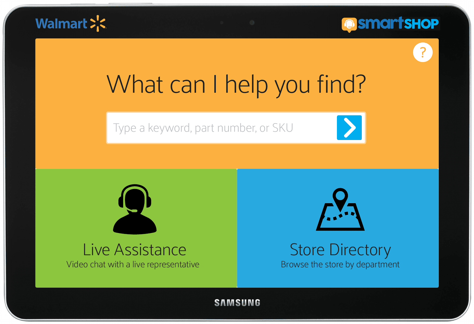
The screen asks what you are looking for and gives you three ways to answer. Type it. Ask a person. Or go look at the map yourself.
The placeholder in the search box reads “Type a keyword, part number, or SKU”, which is three different kinds of shopper in one line. Somebody who knows the word, somebody holding a box with a number on it, and somebody working from a list a contractor gave them.
Search for toothpaste and the exact match sits at the top in green, followed by a section headed Related Items: toothbrushes and mouthwash. A person walking to that aisle is often going for the errand rather than the item, and the errand is usually bigger than the word they typed.
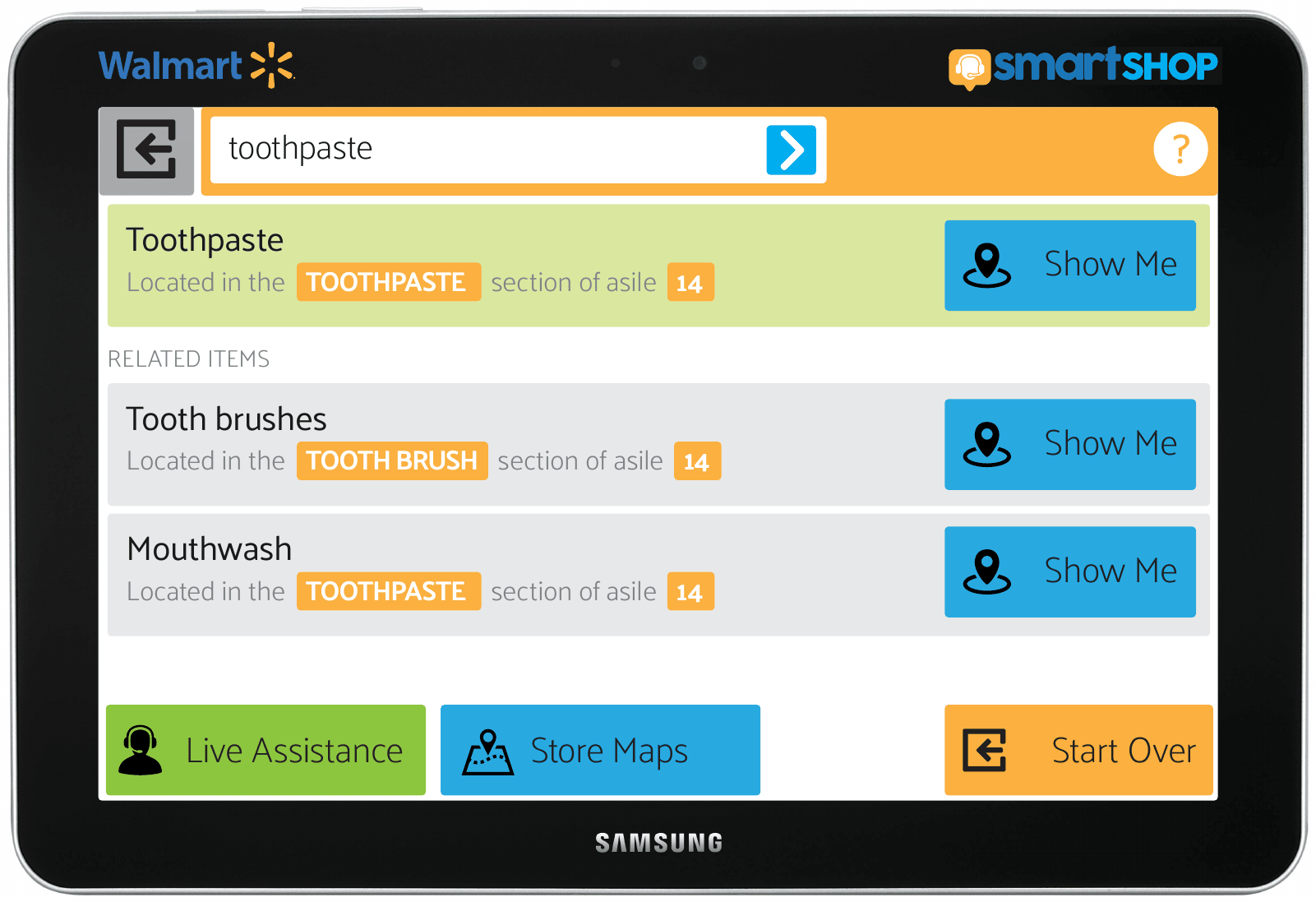
That button says Show Me. Not View On Map, not Locate, not Details. Show Me is the thing you actually say out loud to somebody in a blue vest, and the whole point of the product was to stand in for that person. The label was free and it was the most important word on the screen.
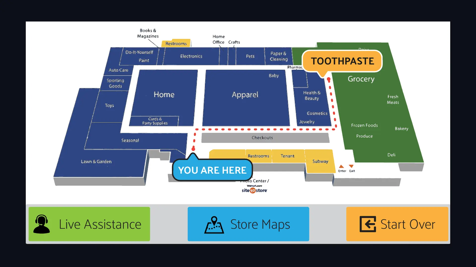
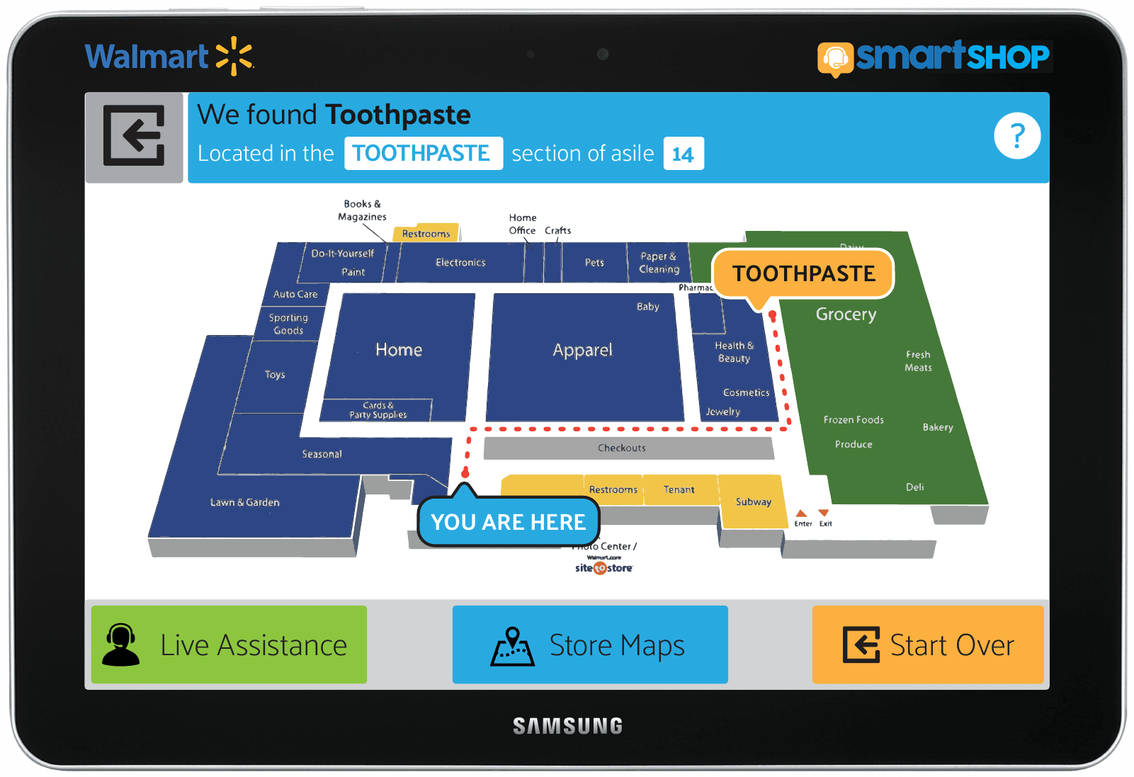
Press it and you get the payoff: a drawn floor plan of the store, a marker reading YOU ARE HERE, the destination flagged in a callout, and a dotted red line running between the two along the aisles you would actually walk. Not a highlighted rectangle. A route.
The states nobody asks you to draw
Concept work is normally drawn at its best moment. The search always succeeds, the screen is always full, the connection is always instant. That is what makes concept decks feel weightless. It is a habit I was evidently already suspicious of.
Tap Live Assistance and you do not arrive in a video call. You arrive in a waiting room: a spinner, the line “Please wait while we connect you”, and a Cancel button. Somebody has to draw that screen or the product does not work on the day the queue is four deep.
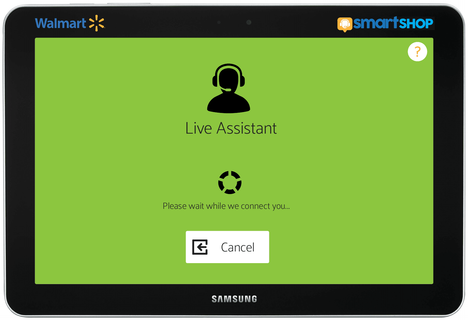
When the call does connect, the Cancel stays put in the corner and the search box stays live underneath the video, so you can keep typing while you talk. The assistant is help, not a mode you get trapped in.
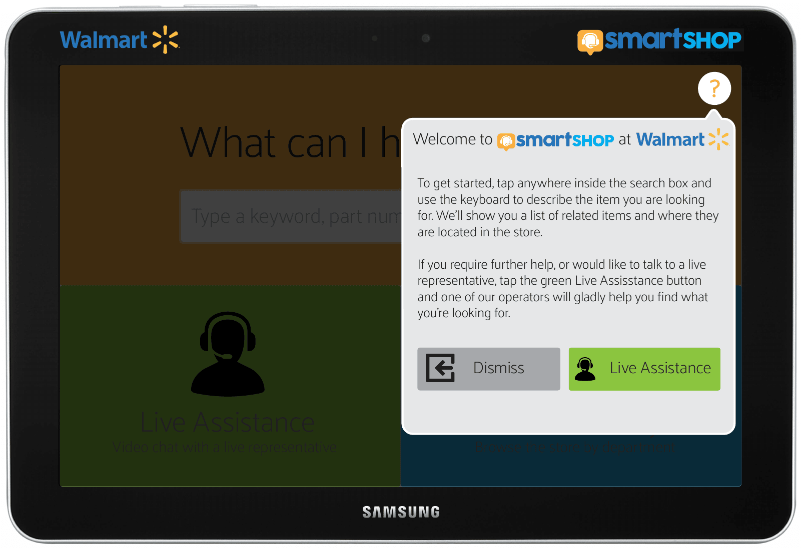
There is a first run panel too, hung off the question mark in the corner, dimming the screen behind it. It explains the search box in two short paragraphs and then offers two buttons: Dismiss, or go straight to a human. An explanation that ends with a way to skip the explanation.
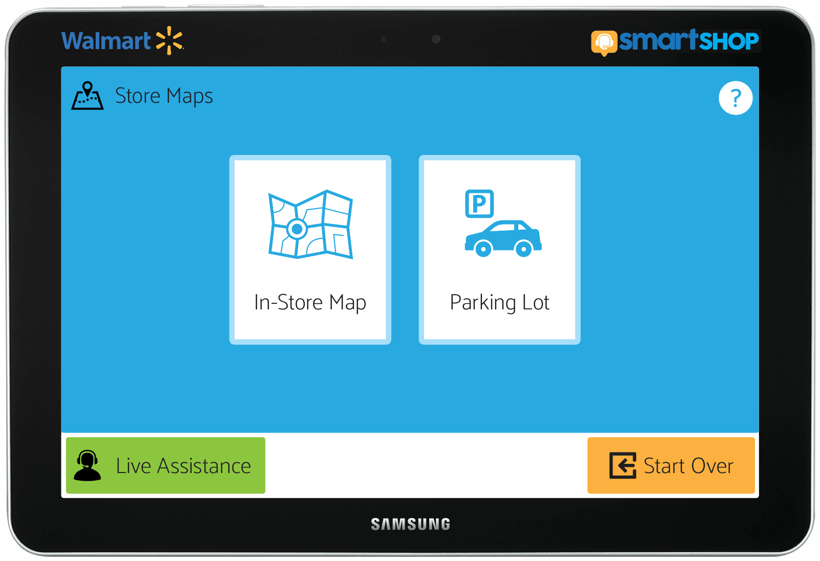
And the maps menu has two entries. One is the store. The other is the parking lot.
The browsable map carries a breadcrumb back to the menu and a small tooltip reading “Touch any department for a more detailed map”, so the floor plan is a drill down rather than a picture. That tooltip is doing the job a sign does in a real store, which is to tell you that a thing you are looking at can be touched.
Then I stopped drawing it
On July 11 I built the home screen as a real page, in one sitting, between half past eleven in the morning and just before five. The whole thing is thirty six lines of CSS, one page, and four icons.
Everything in it is sized in percentages, so the three zones split the viewport in half and then in half again no matter what screen it lands on. A kiosk has no known resolution. You are designing for a panel somebody else will buy. The icons went out as SVG for the same reason, redrawn to vector so they stay sharp on a screen nobody has chosen yet, which in 2015 was a decision rather than a default.
It still runs. This is the actual 2015 page, served today, still pulling its typeface off the web the way it did then.
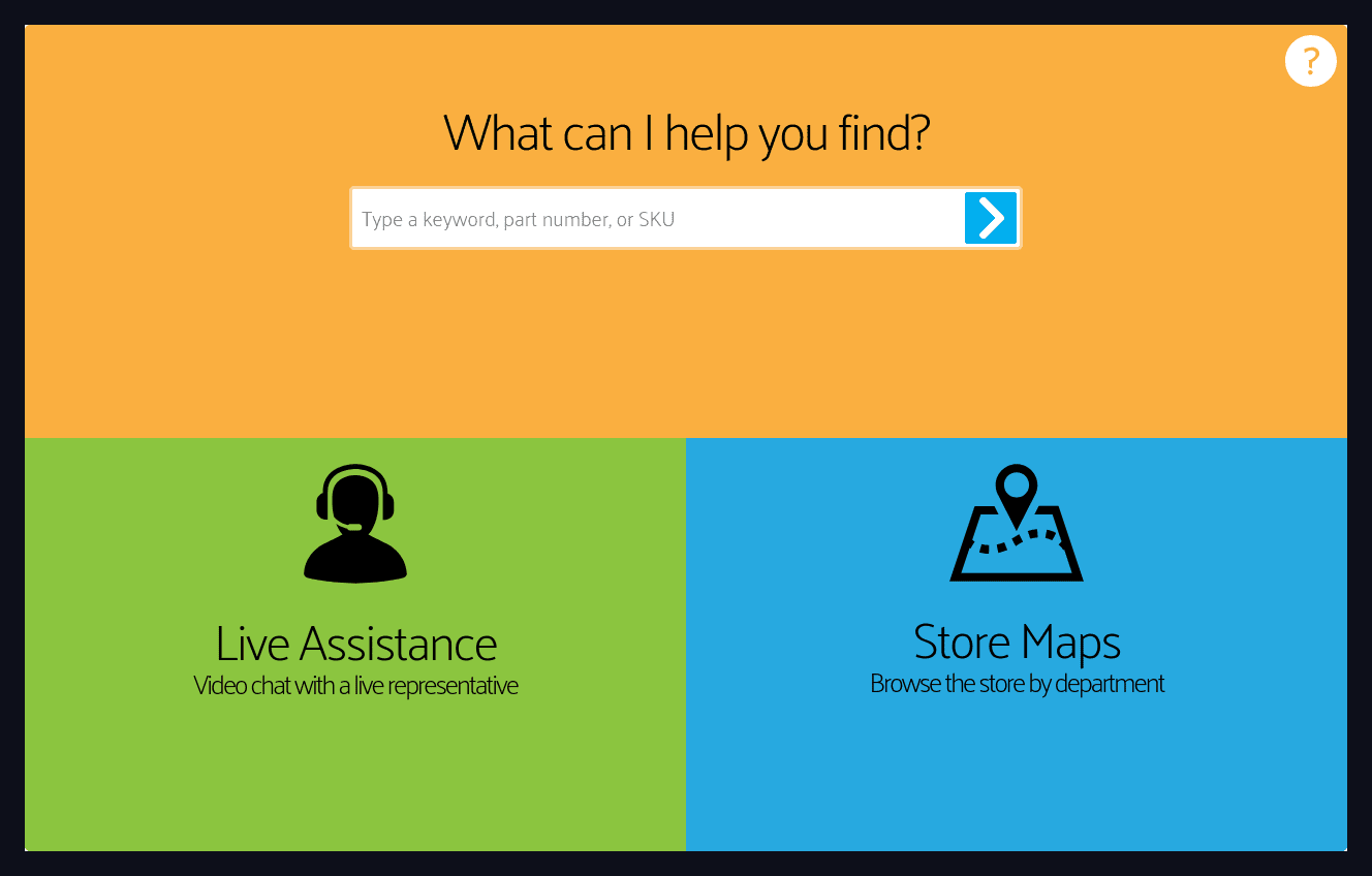
That gap is the honest part. I built the half that had to be proved. The chrome across the top, the logos, the framing, all the parts that only had to be believed, stayed in Illustrator where they were cheaper.
What is wrong with it
There is no empty state. Nine screens and not one of them is what happens when the store does not stock the item you typed. That is the screen a real shopper hits on a bad day, and it is the one I would draw first if I picked this up tomorrow.
The drawings say Store Directory and the built page says Store Maps. Nobody reconciled them because nobody had to, which is exactly how that kind of drift gets into shipped software.
There are two spelling mistakes sitting in the finished comps. The icons are not mine either. They came from an icon library and I placed them and exported them, and a case study that let you assume otherwise would not be worth reading.
Where it went
Nowhere. There was no pitch, no meeting, no polite decline. Two people at a tire shop spent nine days building a thing for the largest retailer on earth and then never sent it, and I do not have a good explanation for the last part.
What I keep from it is not the idea, which was not mine, and not the wayfinding, which has since been solved by the phone in everyone’s pocket. It is that somebody described a thing out loud and nine days later it was running. The distance between a conversation and a working page is mostly a decision about whether to start.