
Richie Rich Services is an air conditioning and refrigeration contractor working Miami-Dade and Broward. In 2015 they needed everything: a mark, a website, and a van people would remember. I did all three while I was employed at the tire shop down the road, on the tire shop’s copy of Illustrator, hosted on the tire shop’s server.
None of it is filed under their name. Every asset lives in a folder called rr, which is why I nearly lost it.
Dates read out of the design files, the Dreamweaver deploy logs and the site’s database, not from folder timestamps
Three ways to draw a name
Two weeks in April, three directions, and they are not variations. They are three different arguments about what the business is.
The first plays the name. A man in a suit tearing his shirt open on an R shield, because the company is called Richie Rich and you may as well lean into it. The second plays the trade: a condenser fan impeller in a blue disc, cool and technical, with a bar underneath reading A/C installation and repair. The third plays the person. A cartoon technician with an oversized wrench over his shoulder.

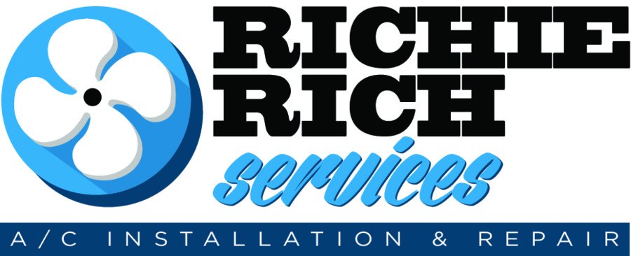
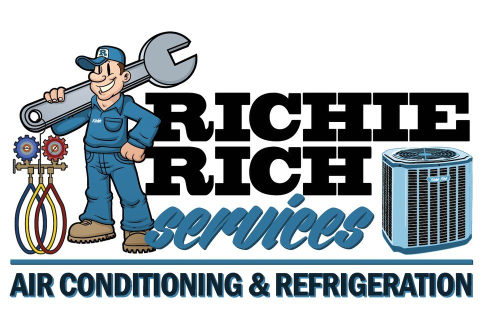
What stayed fixed across all three is the type. Same slab caps, same brush script under them, from the first file to the last. I settled the voice early and then spent two weeks arguing with myself about the picture.
The runner-up shipped first
The mascot won. The fan blade went live.
I started their website in April on concept two, while concept three was still being finished, because a contractor in Florida in April does not have the luxury of waiting for the perfect logo before he has a website. The fan blade held the door open for a few weeks. The mascot replaced it in May.
I know it was May because WordPress kept the upload date, May 19, and a backup of the site from May 30 already has the mascot set as the logo.
Photograph the tool, then draw it
The mascot needed something to hold, and I did not want to draw an air conditioner from memory.
On May 6 I went out to the lot with a camera and took four frames of a refrigerant manifold gauge set, held up against a white van under palm trees. The whole shoot is ten seconds long by the timestamps. The gauges are the tool an AC technician actually carries: two dials in ribbed rubber boots, a brass body, three hoses in blue, yellow and red.
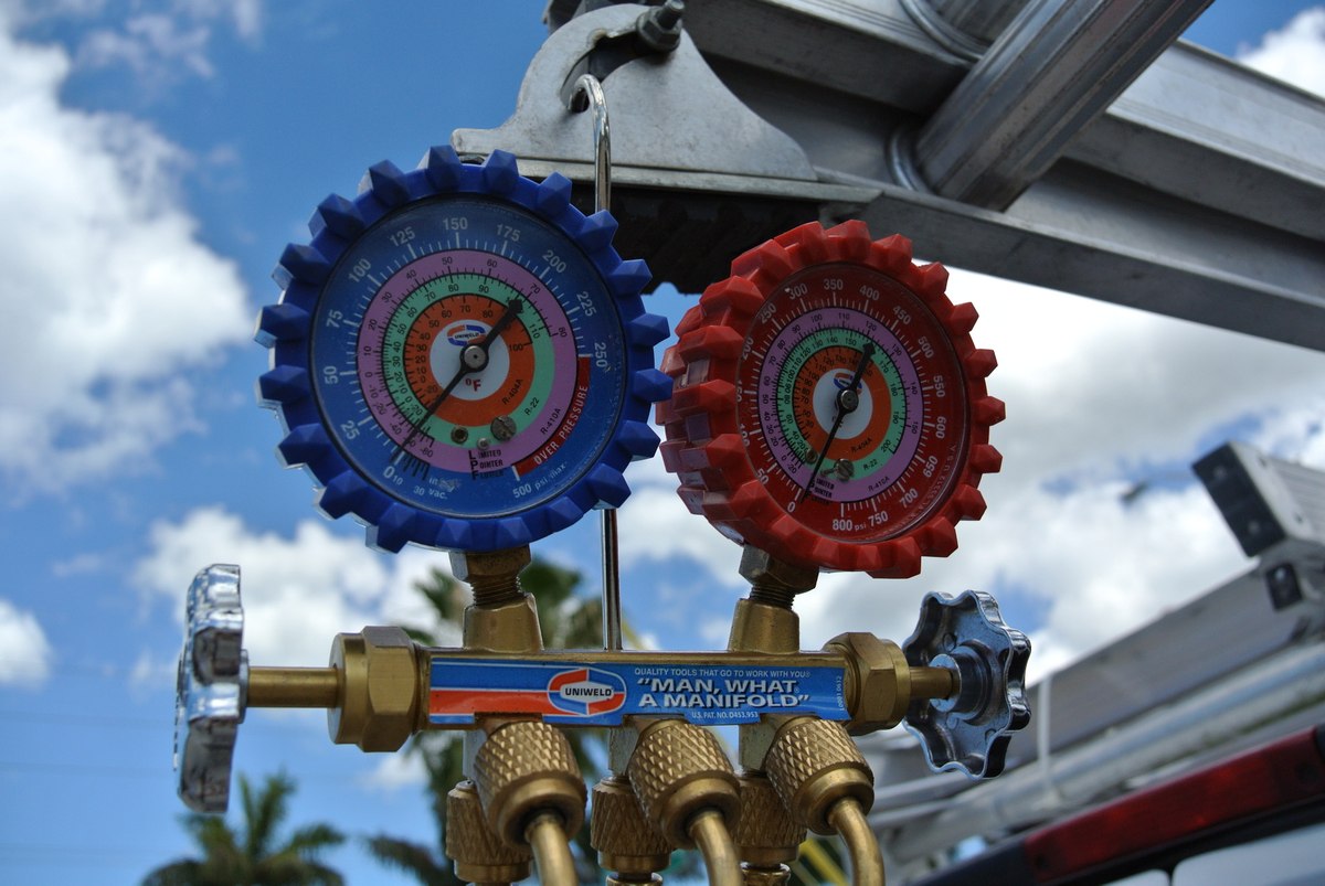
Three days later I opened the best frame in Photoshop, laid it under a new Illustrator document, and drew the whole set as flat vector. Both boots with their concentric dial faces, the brass body, the three ports, the hook it hangs from, the hoses looping down.
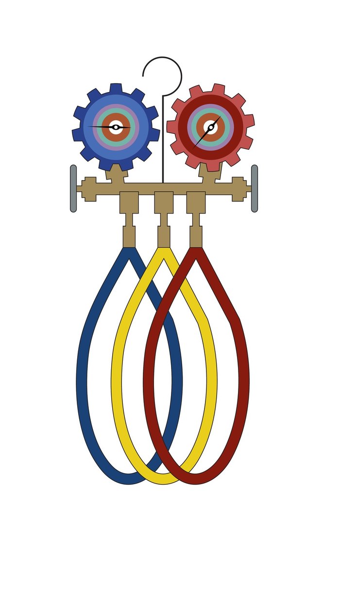
That drawing is what the technician is standing next to in the final mark, and it is what ended up on the side of the van at roughly life size. A real object, photographed, traced, and then driven around two counties for years.
The valve handle I lost
The drawing has two valve handles, one at each end of the brass body, because the real tool has two.
At some point while assembling the full lockup I moved everything across the canvas at once, and one of the handles did not come with the rest of it properly. It ended up inside the brass body, underneath the fill, invisible. The left handle is there. The right one is a bare brass stub.

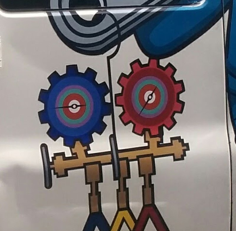
I did not notice. The client did not notice. The sign shop did not notice. It went onto the letterhead, onto the website, into the logo served on every page, and onto a vehicle at about eighteen inches wide, and it is still there in the photograph of the finished van.
I am including it because I think it is the most useful thing in this case study. Every process I have ever worked in says a mistake like that gets caught: by the proof, by the client sign-off, by the installer, by somebody. It was caught by none of them, because none of them knew what the drawing was supposed to look like. I was the only person who could have caught it, and I was the person who made it.
That is worth remembering every time a review process feels like a formality.
Two websites, and I replaced my own
The first site was WordPress on an off-the-shelf theme. It worked, it got them online, and by December I had thrown it away and rebuilt the whole thing by hand in Classic ASP on my own include system.
Twenty-nine files instead of nearly two thousand. A quote form. The van comp on the About Us page, and a letterboxed crop of another frame from the May shoot running across the home page.
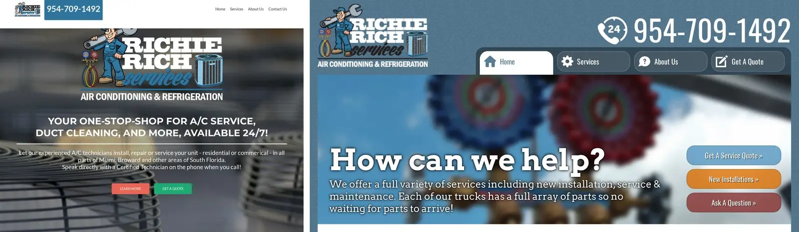
The home page also picks its own title tag at random from seven variants, so the page could present itself as Broward County AC repair to one visitor and Miami-Dade County AC repair to the next. That was 2015 search thinking and I would not build it that way now, but it tells you what the job actually was: a contractor needs to be found, and being found was part of the design brief.
Where it was parked
There is one photograph of the finished van, taken in June 2016. White Chevrolet Express, ladder rack, blue vinyl, the technician and his gauges on the sliding door and the phone number big enough to read from another lane.
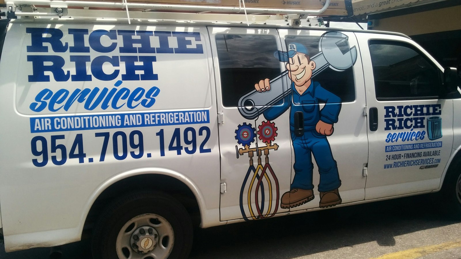
Behind it, out of focus at the top of the frame, is an awning. You can read enough of it to make out the words service and a great price, which is the end of the tire shop’s own tagline.
So the van was drawn on the tire shop’s software, hosted on the tire shop’s server, and photographed in the tire shop’s lot. That is three separate businesses in one frame, and it is a fair picture of those years. I had one job and a list of other people’s companies, and the line between them was mostly a matter of which folder I was in.