
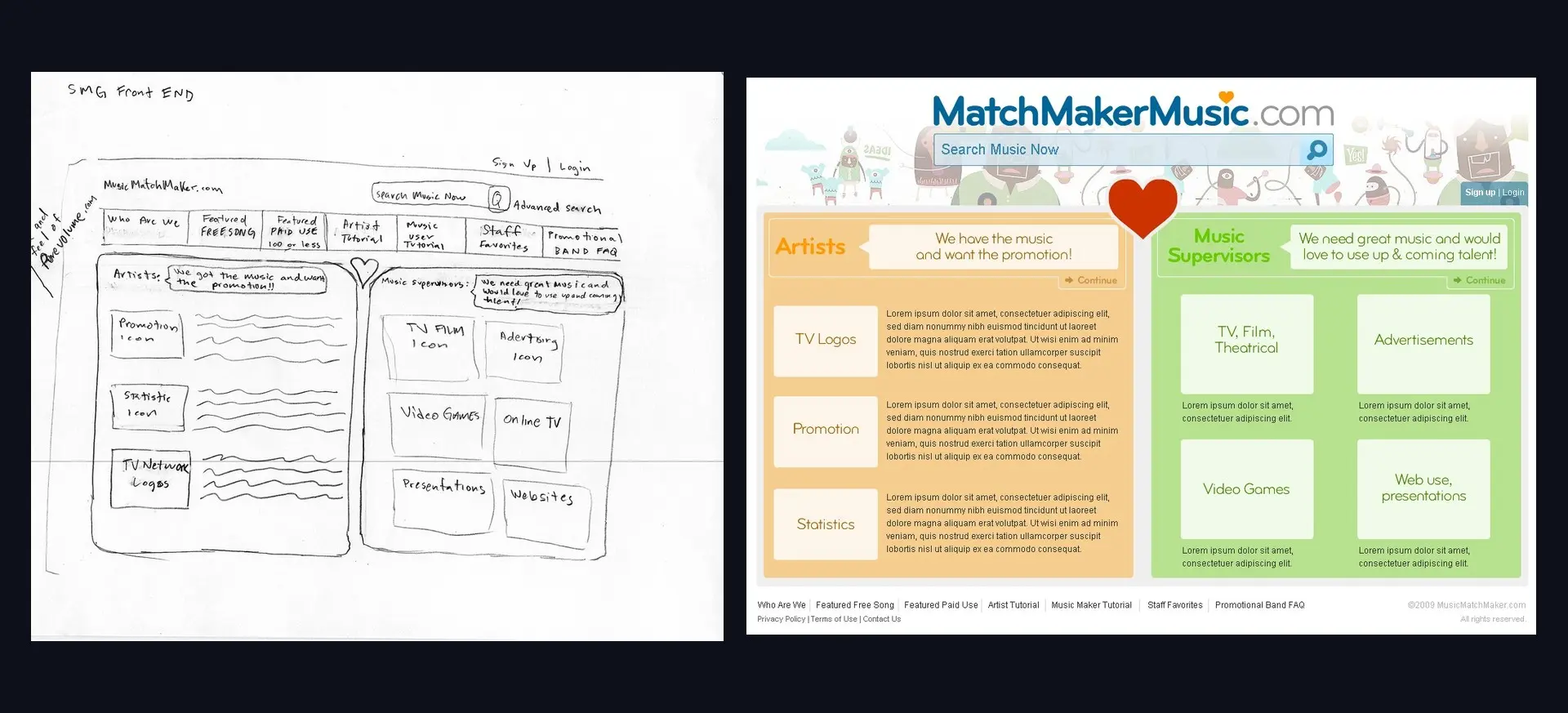
In the autumn of 2009 a music-licensing startup in Santa Monica needed an interface. MatchMakerMusic matched unsigned artists with music supervisors licensing tracks for film, television, advertising and games. Their counsel, Ben Singer, sent hand-drawn wireframes and numbered notes; I sent back finished screens, usually the same day.
This page keeps the paper. Every sketch below is the real scan that arrived by email, and every screen beside it is what went back. I found the lot in the original mailbox seventeen years later.
How one screen actually got made
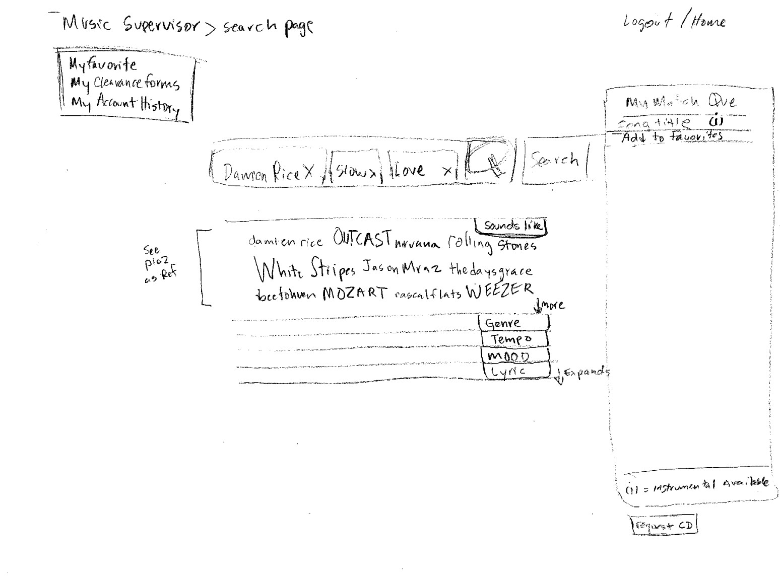
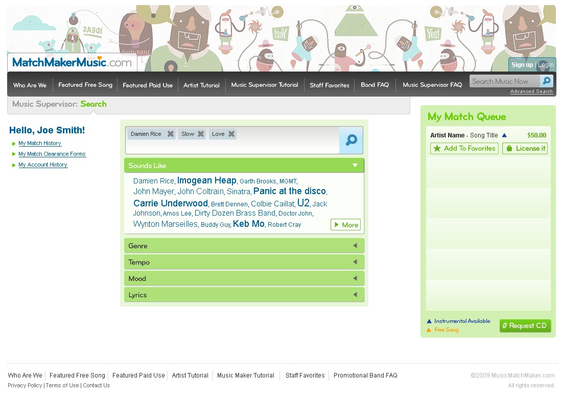
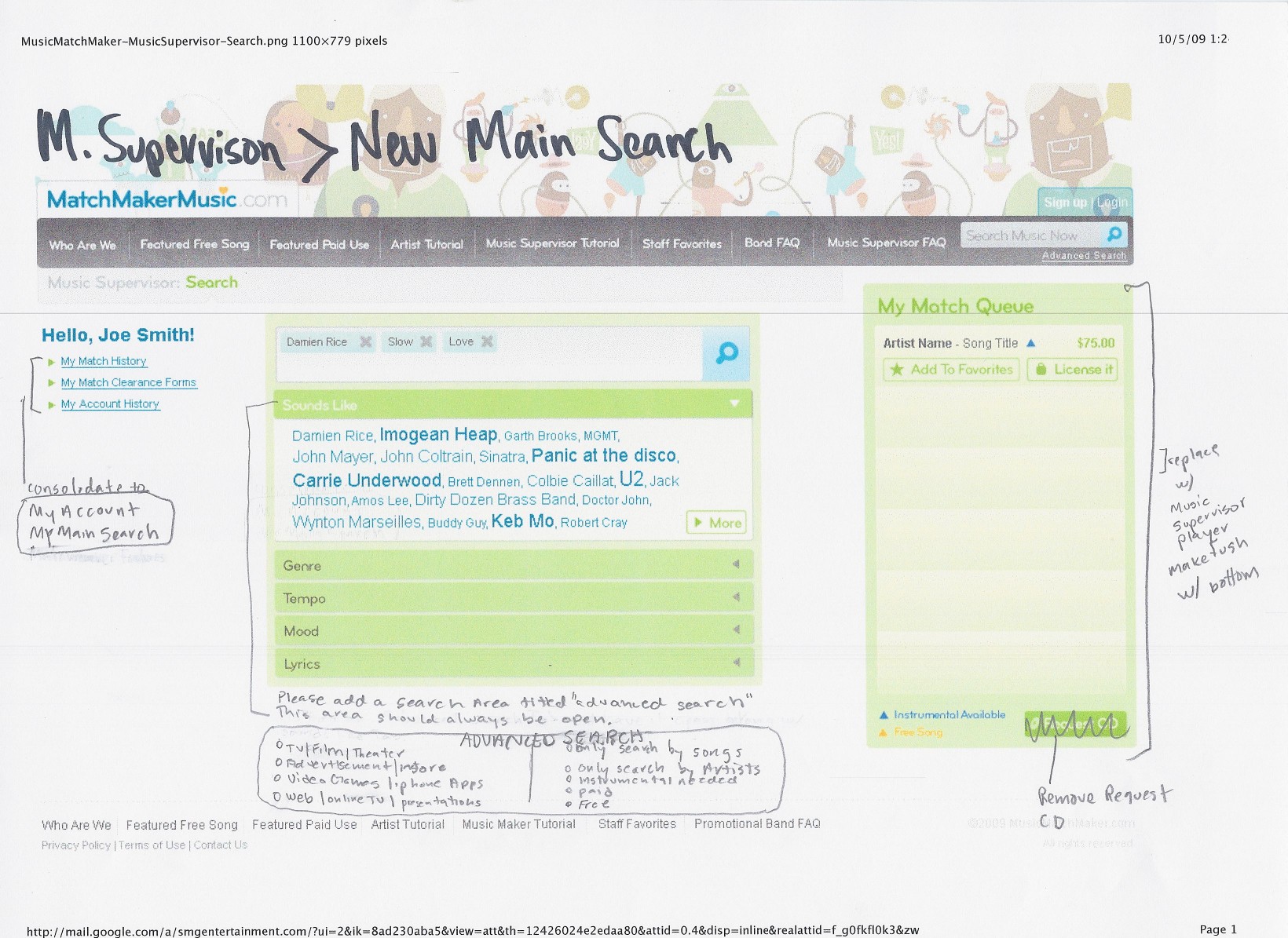
Main Search was the product’s front door and it took the longest. The loop ran sketch, build, redline, rebuild, and the redline stage is the one most portfolios can’t show: my own comp, printed out, written on in pen, scanned, and mailed back. That is what a real revision looks like.
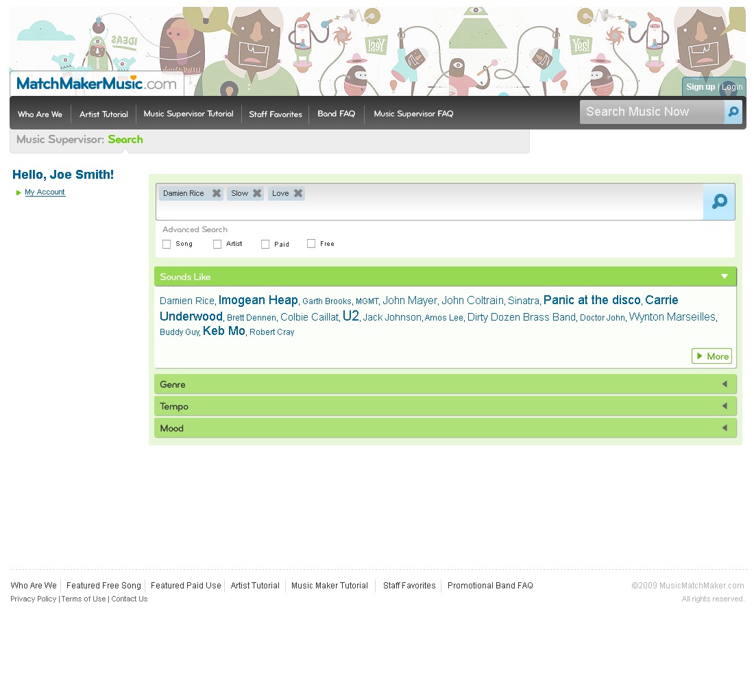
Six revisions in one afternoon
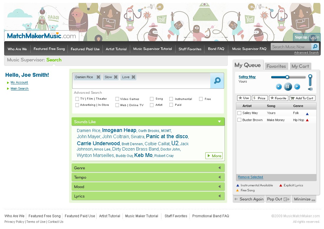
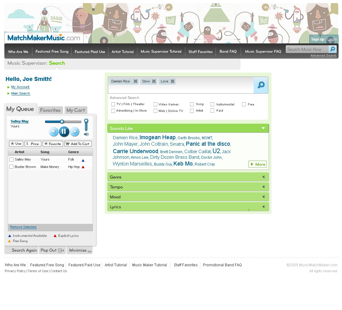
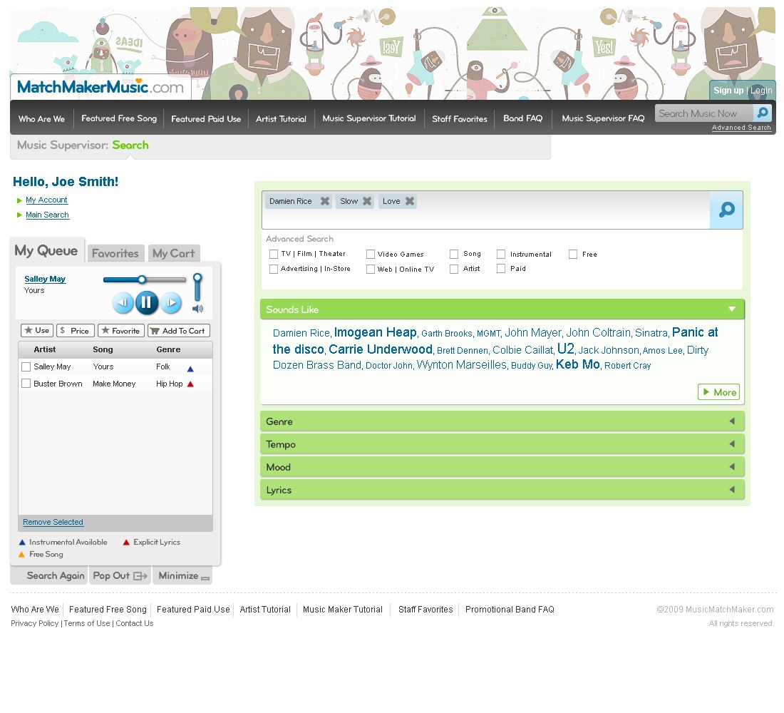
On 8 October I sent fourteen rounds of artwork. Six of them were this one screen, between 11:15am and 3:05pm. Centre the search menus, widen the left rail, swap the artist playlist for the supervisor playlist, flush the queue to the bottom. Each frame is a real delivery, timestamped by the email that carried it.
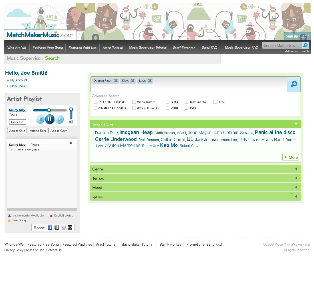
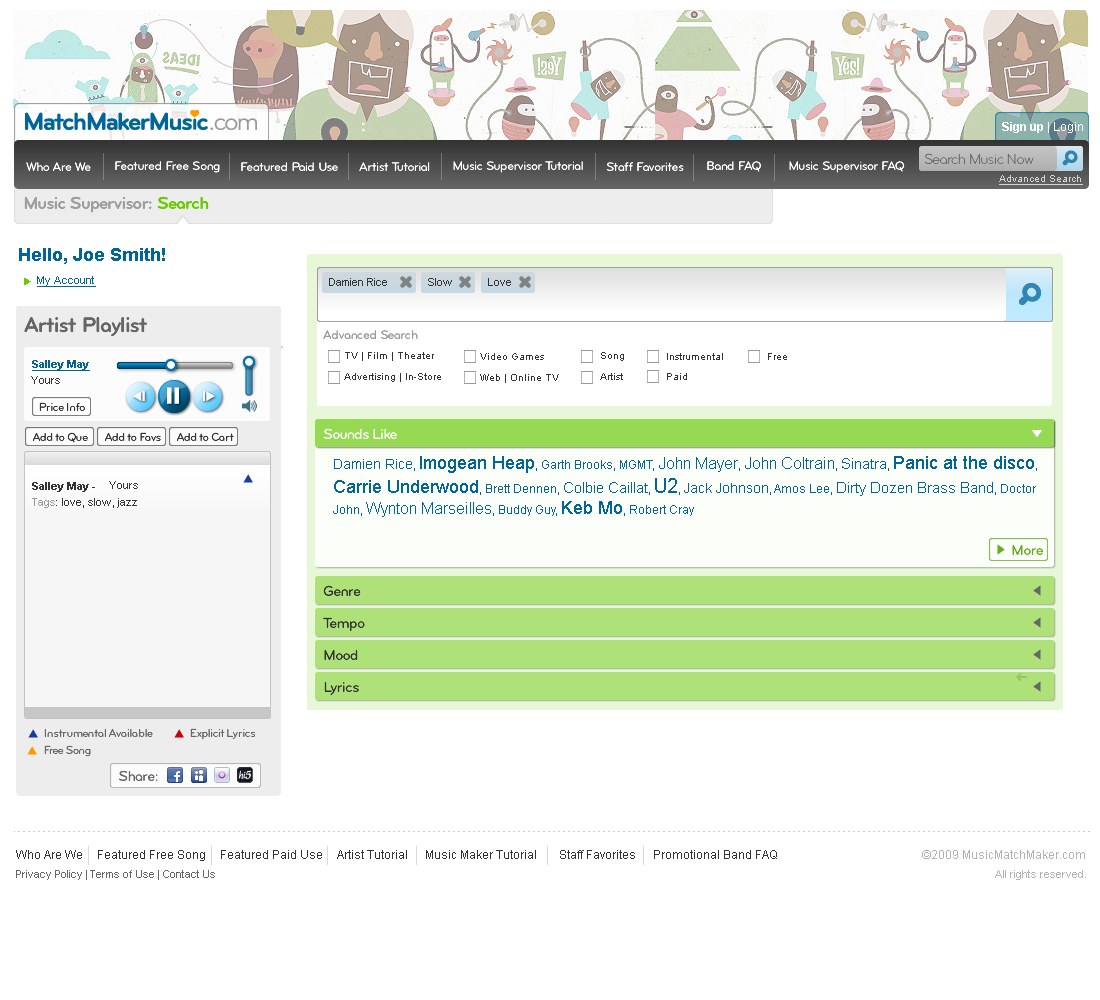
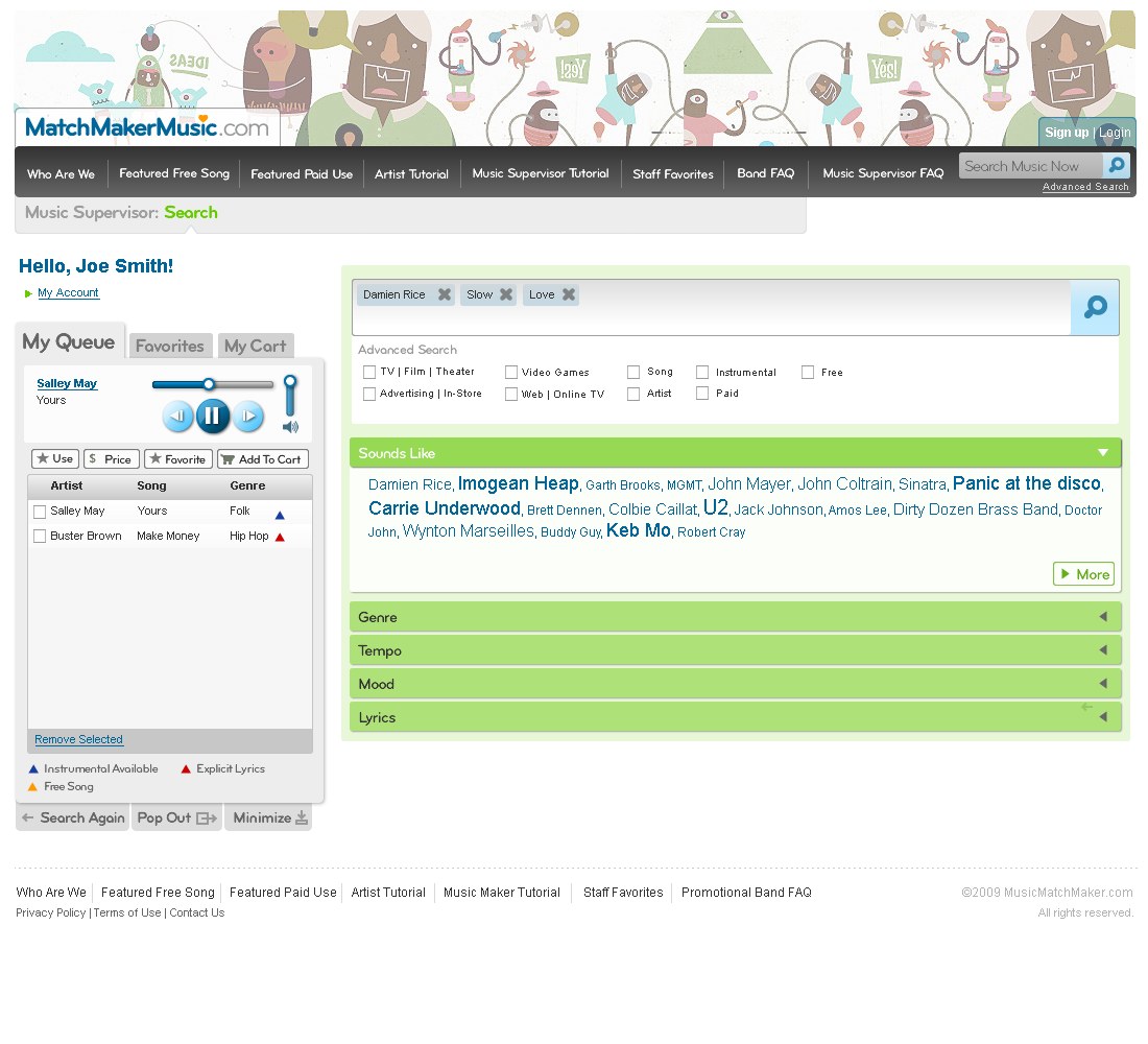
Sketch beside screen
Six more, each one drawn first. What is worth noticing is how much survives the translation. Not just boxes and columns, but pagination behaviour, button order, and in one case the placeholder band name.
Landing page
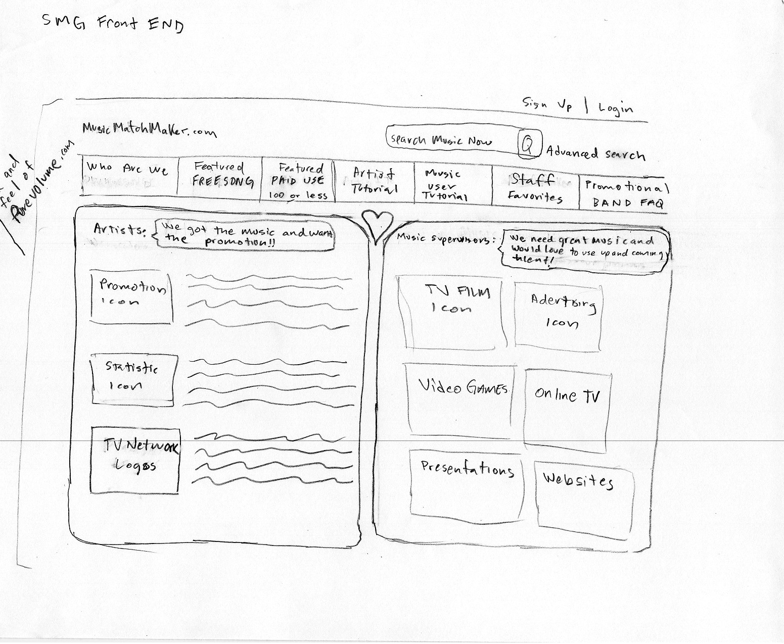
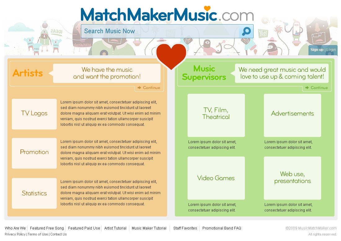
The first sheet, headed SMG Front END and drawn before a single pixel existed. Artists down one side (we got the music and want the promotion!!), music supervisors down the other (we need great music and would love to use upcoming talent!). Both columns keep their tiles through to launch: TV network logos, statistics and promotion on the artist side; TV/film, advertising, video games and websites on the supervisor side. Even the little heart drawn between the two columns is there in the finished page.
Search by Artist
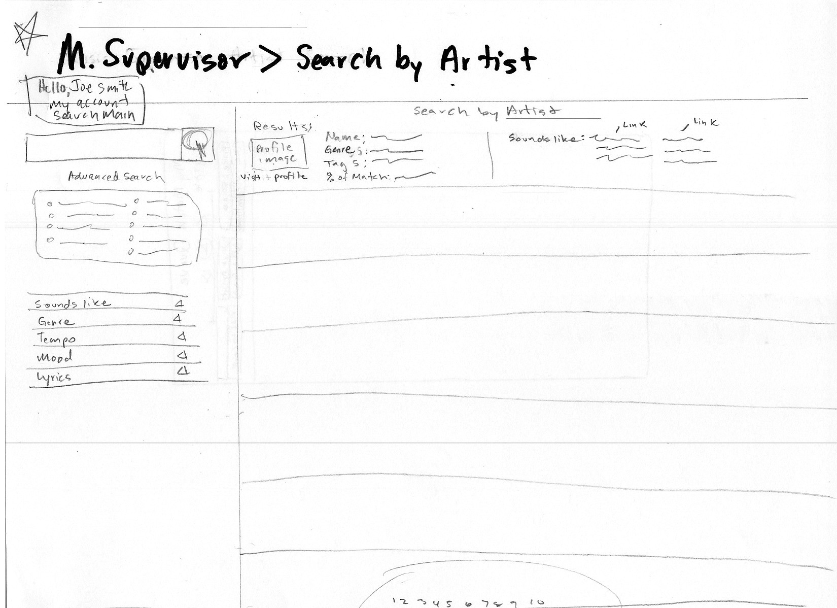
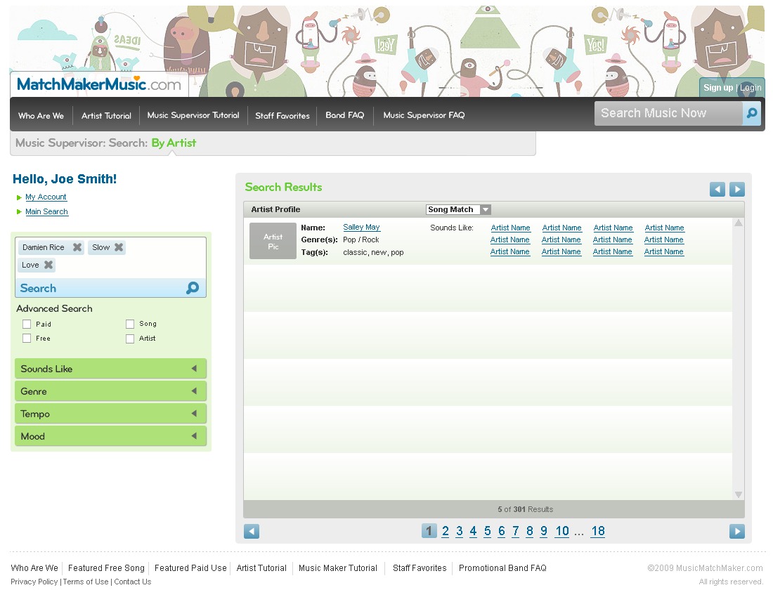
The left rail, the advanced-search checkboxes, the accordion stack and the pager all survive the trip intact. The sketch works out a pager reading 1 2 3 … 10 over 10 of 239 results; the built screen runs 1 2 3 … 18 over 5 of 301 Results. Same machine, different placeholder numbers.
Search by Song
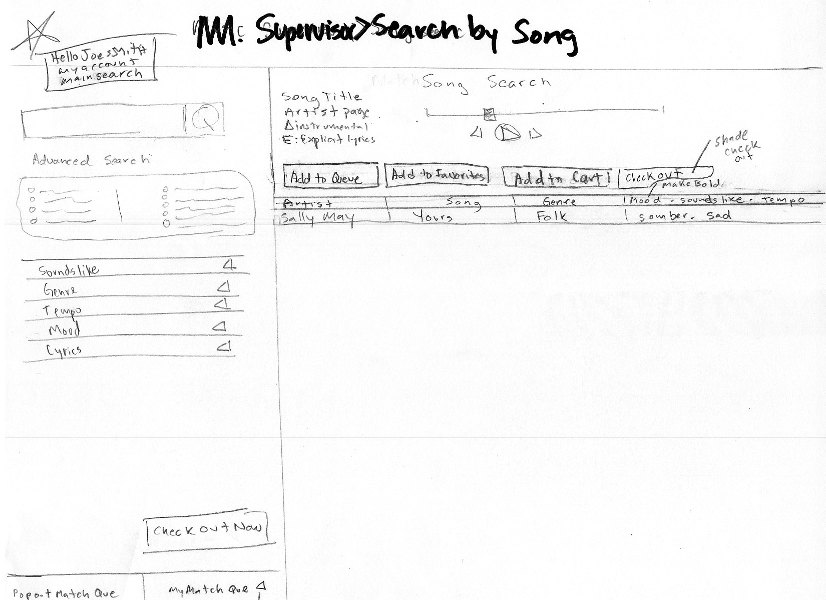
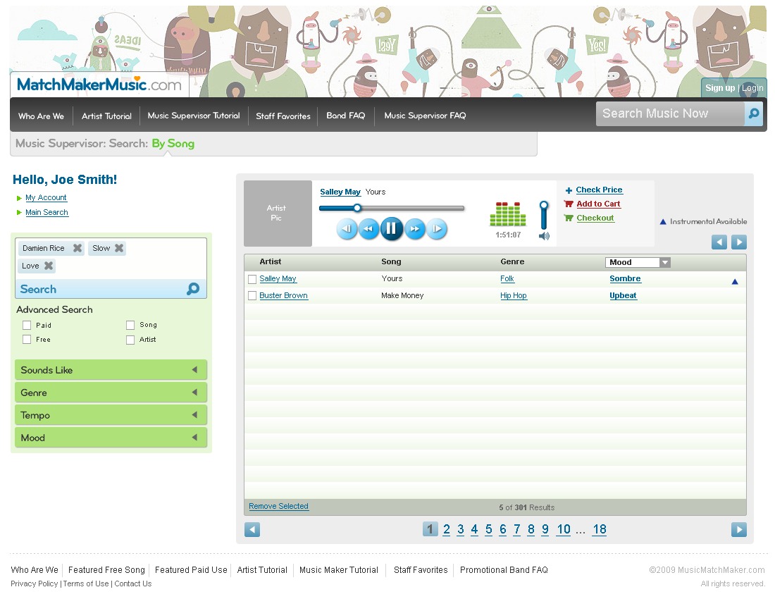
The placeholder data carries through from pencil to pixel. The sketch’s results row reads Sally May · Yours · Folk · somber, sad; the finished table reads Salley May · Yours · Folk · Sombre. Even the four action buttons arrive in the drawn order: Add to Queue, Add to Favorites, Add to Cart, Checkout, with Checkout bolded because the sketch itself says make bold.
Band navigation
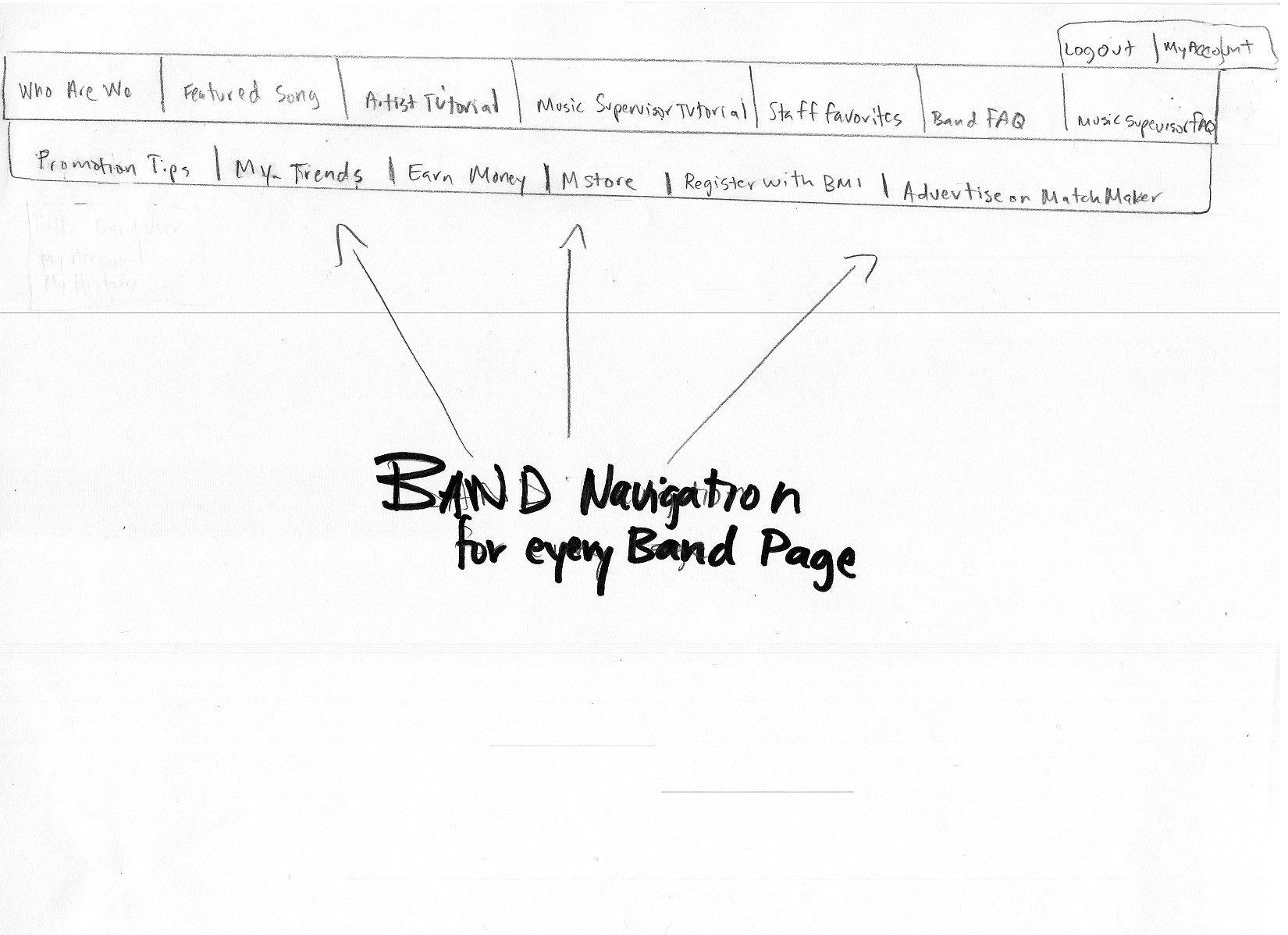
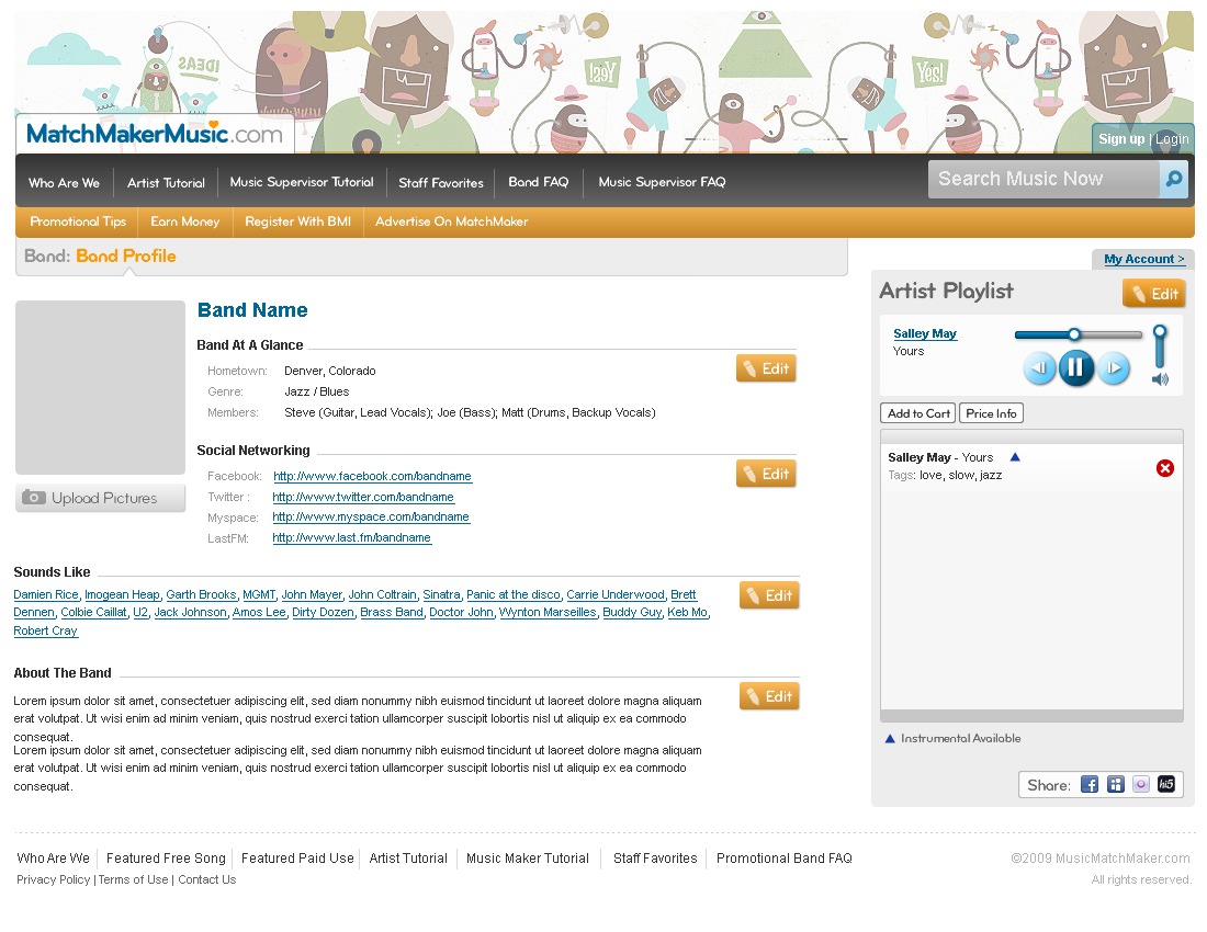
Pure information architecture: two rows of boxes and an arrow. It shipped as two rows of navigation, a dark bar for the site’s own pages and an orange bar underneath for the things only a band needs (Promotion Tips, Earn Money, Register With BMI).
Sign-up overlay
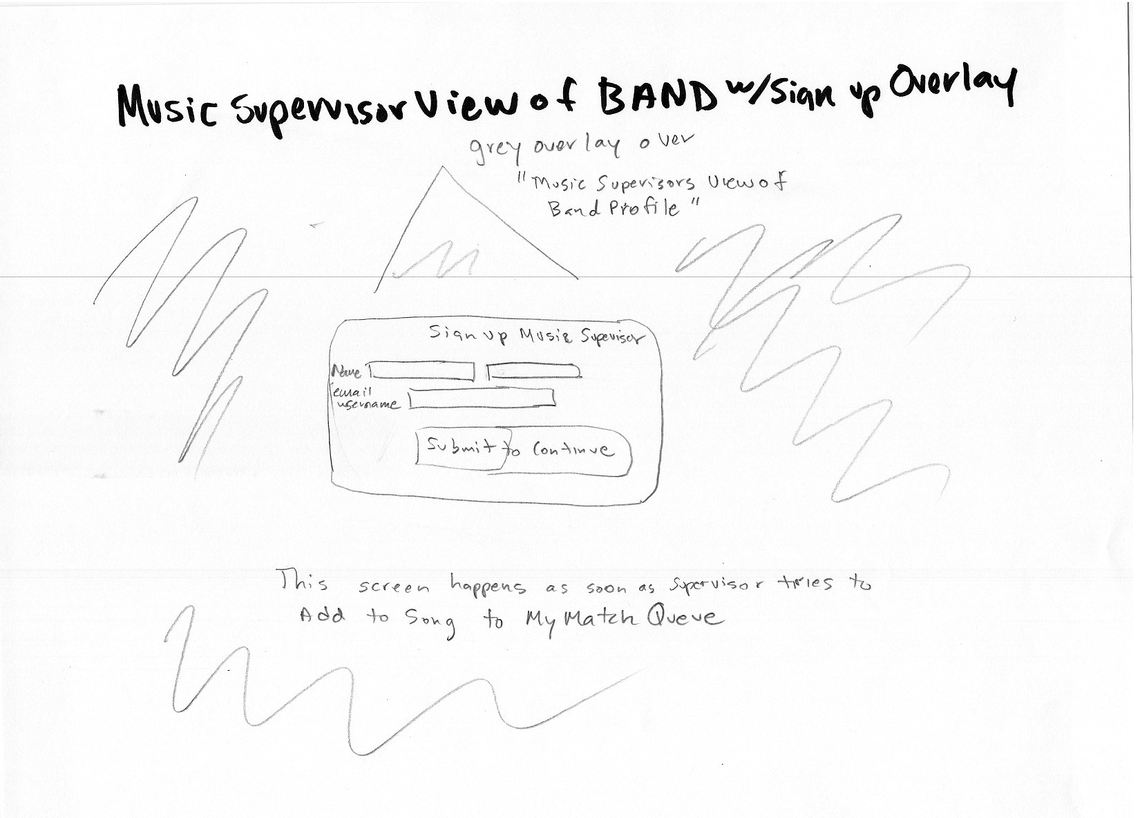
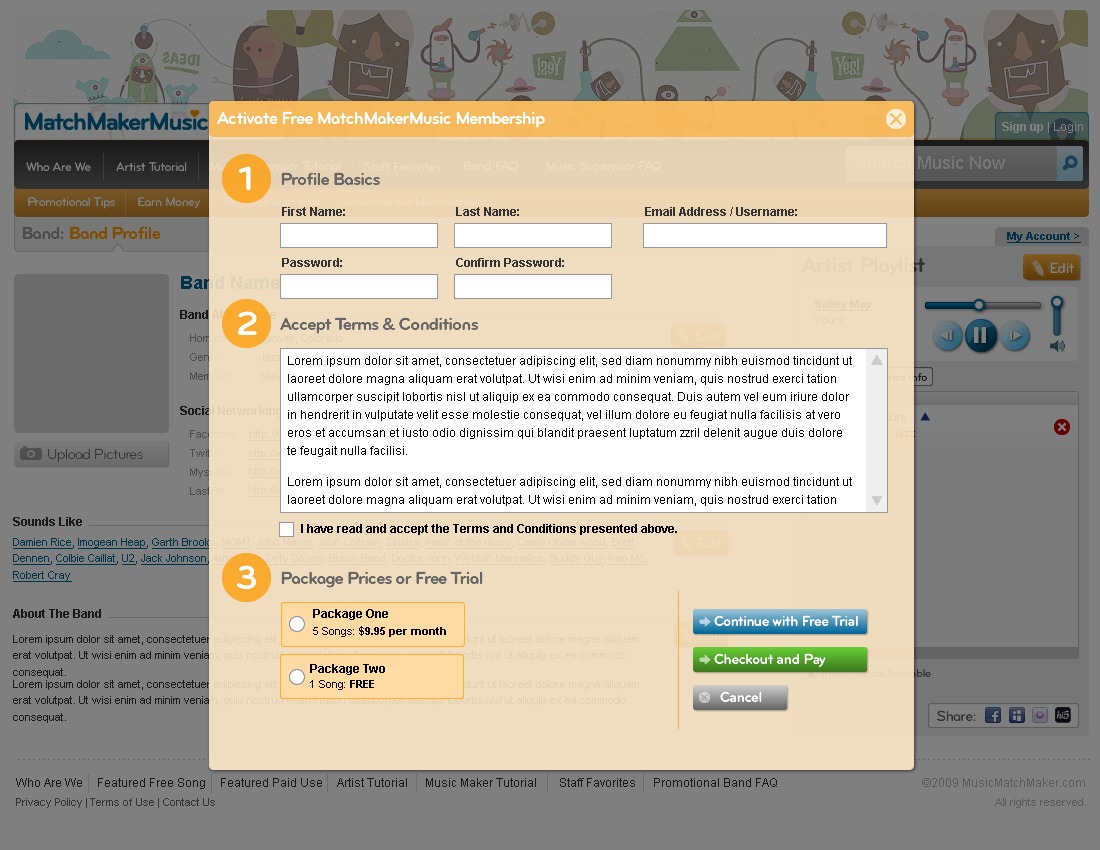
Not a layout, an interaction. The sketch specifies a grey overlay across the band profile, a modal on top, and the condition that fires it: this screen happens as soon as supervisor tries to add a song to My Match Queue. That gate is the business model, drawn in one sentence.
Band profile
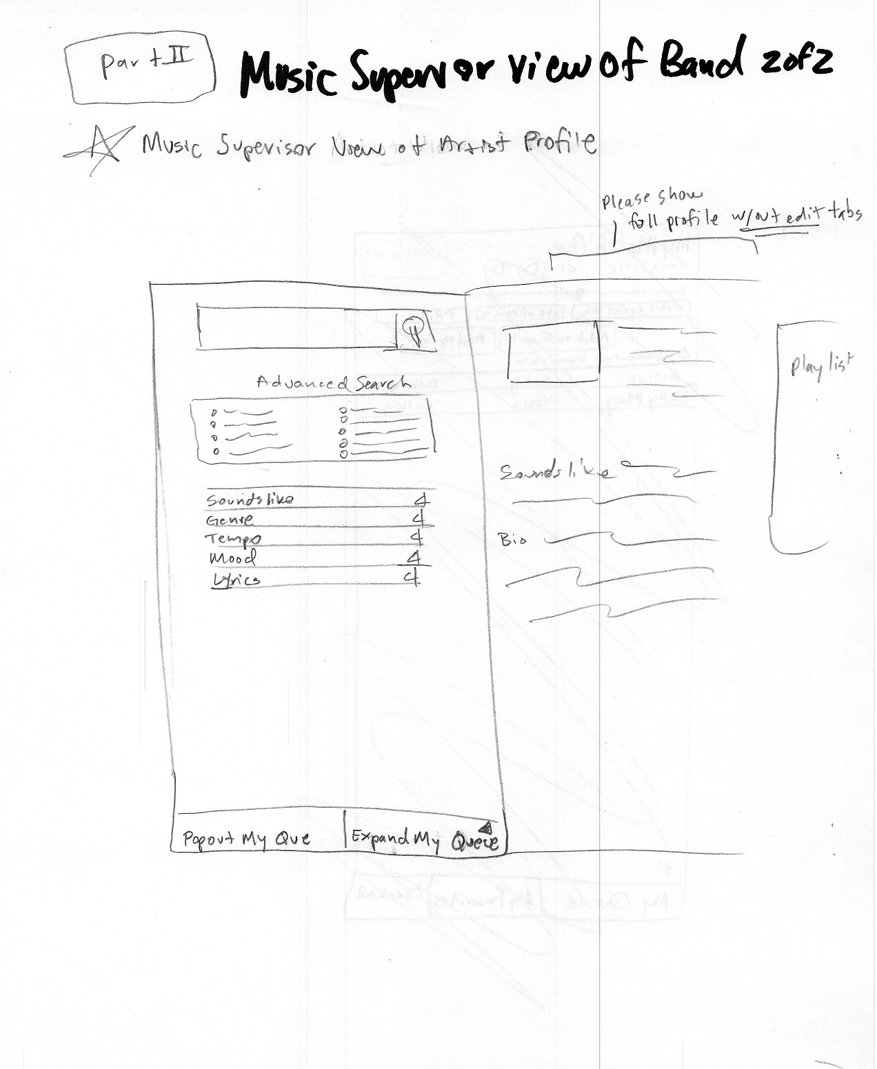
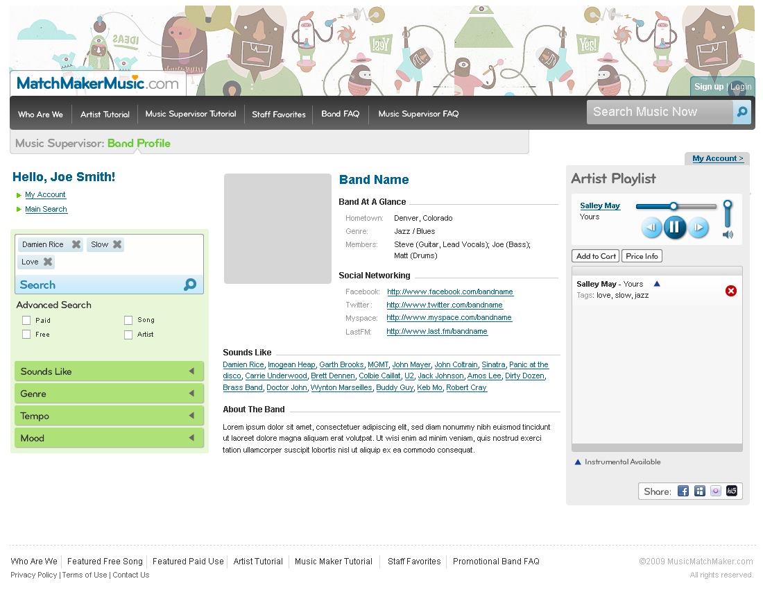
Three columns worked out in about a minute: search rail left, profile centre, playlist right. The finished screen keeps all three and the proportions between them.
What I did
Every screen in the product: the landing page, both search modes, the supervisor’s queue and player, band profiles and their editing states, the sign-up overlays, song upload, and free and paid licence checkout. Two audiences, two sets of screens, one marketplace between them.
Provenance: 69 emails carrying attachments between 29 September and 23 October 2009, 37 sent and 32 received. 27 wireframe and markup PDFs (55 pages) and 78 finished comps. Recovered from the original mailbox in 2026; the images are unretouched apart from cropping the scanner margin and levelling the pencil so it reads on screen.