
DC Movers
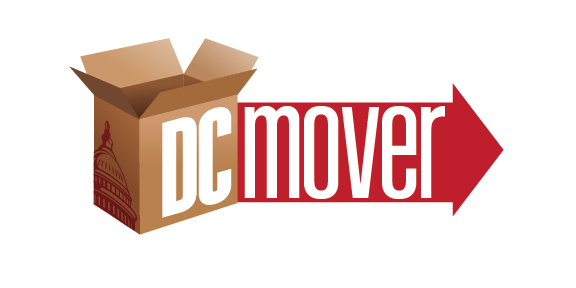
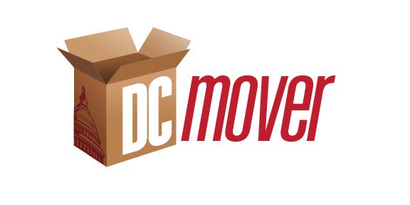
On January 15, 2012 I was on the third round of logo concepts for a moving company in Washington DC. The finals went out the next day. That was four rounds inside a single month, and the volume had a reason behind it. The company sold under more than one name, so there was never one logo to draw. There were two: DC Movers and DC Pro Movers.
The proposal had gone out the previous September. This was the fun kind of job. A logo is one of the few pieces of work where the whole argument fits on one screen, so you can lay them out side by side and compare them honestly.
- 2 marks · DC Movers and DC Pro Movers
- 4 rounds · January 2012
- 33 drawings · all of them below
What four rounds actually look like
The gallery is the exploration in order, not a set of finished marks. I numbered the concepts and lettered the variations, so you can see where each direction stopped. One went eight drawings deep. Another went six. Several stopped after one drawing, and those are the honest ones. An idea that gets drawn once and never again is an idea that did not survive the next round.




What carried forward
The logos were the beginning of it. The same company kept picking up names, Moving Companies DC and Pro Metro Movers among them, and the work kept coming: websites for the marks, and by September of that year a blog running off a database that covered both of them.
That is the part I would point at now. The logo took a month. The work it opened ran for years.